I have 2 words to sum up why you should care about usability testing: Iowa caucuses. Caucuses are already a complicated, rather confusing process that supporters of political parties engage in to nominate candidates. In 2020 the Iowa Democratic Party decided they’d try to make the process easier by creating an app with which each individual caucus site could report their results to the party headquarters the night of the caucuses.
Not only did the app fail to streamline the process, but its failure also made national headlines and raised questions in some circles of the legitimacy of the caucus results. The problem, it soon turned out, was that there had been no attempt to do usability testing, or even user training, in the rush to make the app. Those in charge of the project must have figured everyone these days knew how to use apps, so the investment wasn’t necessary. Wrong. Very wrong.
If you’re designing an app, or website or really anything, you would be wise not to follow the Iowa process. Good, usable design comes from an iterative process in which you create and revise designs in repetitive cycles, coming closer to the desired result with each cycle. One of the best ways to learn how a design needs to be revised is usability testing.
The Importance of Usability Testing
Usability testing is the process of evaluating design and the assumptions about it, against the behaviors and expectations of actual users. Testing with users can reveal what is wrong with a design along with what is right. It can also be used with clients or other stakeholders as a means of justifying your design choices and more expeditiously attaining much-needed approvals throughout the design process.
It’s tempting to want to wait for testing until you have a fully built product to show users. However, discovering problems after the final build can be costly and time-consuming to fix, and more likely to delay the launch of your product or force it to launch with avoidable flaws. It is better to find and correct incremental problems as you go. This means usability testing needs to be integrated into multiple phases of your product development using the mediums available to you at each of these phases, whether those be fully coded, high fidelity, or low fidelity prototypes to approximate the design and experience of your product to users.
The Basics of Usability Testing

In order to successfully conduct usability tests, there are a few things you should do. The first is decide what you want to focus on in your tests. You can’t test everything about your product in one testing session so you need to define what you want to test, how you will do so, and the measures you will use in evaluating what your tests produce.
Once you’ve made these decisions, you need to prepare for the testing sessions. Preparation should include writing a pre-planned script in order to make sure your testing method is consistent from user to user. Your script needs to include a preamble briefly explaining how the session will go, what you are having a user test, and most importantly assuring the user that you are testing the product not them.
The second part of your script should include tasks you will ask your user to complete using your product. When choosing these tasks, it’s important to consider the focus of your product and the most common goals users may have when using it. Tasks need to be written in an actionable form that, if at all possible, avoids the use of words that could give the user clues on how to complete the task. It’s also helpful if tasks can be crafted as a relatable scenario for users. For example, in a recent usability testing session I used the following tasks with my users:
Use the app to pay your annual property tax bill that you received in the mail today.
Use the app to let the city know about a big pothole in the street outside your house.
Use the app to make a reservation at a local Italian restaurant for dinner with friends.
Use the app to ask Animal Control if they have seen or picked up your missing dog.
Also, consider limiting the number of tasks you ask users to perform in order to keep the testing session to 60 minutes or less. It’s been found that users fatigue after this timeframe and results become less productive.
When choosing users to test be sure they are representative of the spectrum of your product’s expected users. Referencing your personas — fictional people you create as a means of synthesizing and communicating the information you know about your users — can be helpful in identifying the right test subjects. It’s been found that 5 users can often point out 85% of the usability problems your product has so if you don’t have resources to do extensive user testing at each phase of your project don’t worry.
Once you are on to the actual testing sessions, it is good to have the right environment and the right people present. You should offer a welcoming space for your users in which they can focus on the test without distractions or anxiety. One person should act as the facilitator, leading the session with the pre-planned script. As the user interacts with a product, facilitators should not offer help or guidance, however tempting it may be, since this can negatively impact the accuracy of the testing. You want to know what does and doesn’t work for a user under real-world conditions.
If you are using paper prototypes for your testing session you will need someone to act as the human computer, laying down and picking up parts of the prototype as the user interacts with it. Human computers should refrain from talking to the user in order to avoid confusion. It’s also helpful to have other members of your development team act as observers, watching the test and taking notes.
Even with observers, it’s important to always record your testing sessions, preferably in video format, so you can reference them later. For in-person testing, this requires you set up a camera, a smartphone will usually do, focused on the user’s interactions with the product, not on their face or the facilitator. If the testing is being conducted remotely, as via a video conferencing tool, be sure to make a screen recording, also with focus on the user’s interactions. Lastly, before recording a session always get the user’s permission.
Test No Matter What
The most important thing to remember, no matter the resources you have available for usability testing, is that some testing is better than none. More often than not, projects don’t go as planned — budgets change, schedules shift, and, as in my case, global events change everything about how we conduct business and life.
I’ve been working on the design for a companion app for my city’s municipal website. I reached the point at which I was to conduct in-person usability testing with my paper prototypes to understand how well my navigation design worked for users. Testing with paper prototypes offers you your earliest opportunity for usability data in the design process which gives you more time to make improvements and ultimately offer a better final product.
Top companies even embrace testing with paper prototypes. For example, the cheap and fast nature of this medium in testing allowed Mozilla to progress through 7 prototype versions in just 2 weeks of testing when redesigning their support website. That’s some rapid-fire delivery of and response to user-driven insights.
You can see an example in the video above of how usability testing with paper prototypes is supposed to go — a user in the same room as you physically interacting with the paper prototypes. When you’re living in the time of the COVID-19 global pandemic, though, being physically near other people isn’t part of life anymore. Social distancing guidelines changed my plans, but they didn’t stop them.
I used the Prototyping on Paper (POP) app by Marvel to turn my paper prototype screens into an interactive digital prototype to share with my users while remotely conducting testing sessions over video calls on Zoom, as shown in the above video of my first testing session.
Zoom allowed my users to share their screens with me so I could see them interacting with the prototype and it allowed me to record the sessions. The biggest loss in doing paper prototyping this way was the advantage paper offers in making edits and changes to the prototype live during the tests in response to problems users encounter.
During my second testing session in the above video, my user seemed to be a little thrown that information did not appear in fields when he typed or when he made choices from dropdown menus, causing him to click on some things twice. In-person I could have adjusted by quickly throwing a piece of paper with a squiggle on it on top of each field as he interacted with it in order to reassure him it reacted to his actions and to help him track his progress.
Instead, I had to verbally explain to him to imagine that process was taking place. This feature was not one I was testing and would be something naturally coded into the final product, but not having a way to meet my user’s expectations during the test did make it slightly less smooth of an experience for this user subject.
The other disadvantage in my particular situation was that I did not have anyone else able to observe during the tests, so I may have split my focus too much. Since I was recording the sessions, I knew I would be able to review them later, but I still got caught up in watching what my users were doing with the prototype and taking mental notes in the moment
With my second user, I accidentally forgot to immediately ask him to do the fourth and final task. Luckily there was an opportunity to circle back to it as he was making final comments about the app, but it still meant my 2 sessions were not as consistent as I would have liked for this round of usability testing. Know that the role of facilitator requires balance of focus between paying attention to the user and their actions and executing the script as planned so it’s important to choose the right person on your team for it.
Insights from my Testing

Even with the changes to my testing process and its limitations of my paper medium, I was able to gain some helpful insights about this phase of my app design. My users were owners and users of Apple products, which is good since this prototype was designed for the iOS version of the app. My users commented that the app felt very straightforward and easy to get around. This was a nice confirmation that at a high level my design may be on the right track for aligning with iOS users’ mental models.
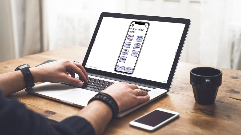
The biggest problem I observed was both users hesitated at the navigation label “Things To Do.” They both eventually chose the category correctly during the task requiring them to make a restaurant reservation, although User 2 chose a different route first. The labeling does not seem to be confusing to users, but I may now consider alternative language or category reorganization if it can offer more immediate clarity.
My interest in offering some multi-route navigation also seems to be relevant. I included 3 tasks in the test that each had 2 separate routes, other than search, that users could take to complete them – reporting a problem to Public Works, making a restaurant reservation, and contacting Animal Control. User 1 chose “Payments & Requests” in the main navigation to report a problem and “Things To Do” to seek out restaurant reservations. User 2 first chose the “Public Works” menu category to make a report, then the map feature to find a restaurant (there was a small technical problem with a link in the prototype for this route, but late enough in the task that it doesn’t suggest an issue with the navigation design itself).
Both users defaulted to the live chat feature to contact Animal Control. User 1 and User 2 both seemed pleasantly surprised and excited by the option to live chat with government entities. This was an unexpected, but valuable insight. If the UX of the chat feature is done well then it offers the opening to redefine resident expectations for communicating with government entities to be easier and more convenient.
User 2, though, did highlight how offering both live chat along with a basic email contact option was valuable since not all things require an immediate response or are done at times of the day when government employees are available. I had wondered if both options were overkill, but his statements seem to indicate my logic in having both is not wrong. He also mentioned that adding a phone contact option may be good for users who prefer that method.
Embrace Usability Testing
As you can see from my experience, usability testing is about being open to the truth about your design. It’s really easy to fall in love with your design choices early and want to marry them for the rest of the project. Sometimes testing will confirm you’re on the right track and you can be excited that you predicted well.
Other times, though, testing shows you what isn’t perfect about your design, which can make you feel embarrassed or incompetent or may even make you want to irresponsibly dismiss users as being flawed in their assessments or abilities. Try to resist these feelings.
Instead, be excited when testing finds problems because now you get to make your product better and maybe even be pushed to break through to a new level in your design abilities. Be excited because it shows that you were smart and humble enough to run tests and not rely on your opinions alone. Be excited because your project is now far less likely to suffer the fate of the Iowa caucus app.
References
Farrell, S. (2015, August 30). Test paper prototypes to save time and money: The Mozilla case study. Nielsen Norman Group. Retrieved from https://www.nngroup.com/articles/mozilla-paper-prototype/
Mak, A. (2020, February 4). Iowa democrats’ first failure was not testing that calamitous app. Slate. Retrieved from https://slate.com/technology/2020/02/iowa-caucus-app-fail-shadow.html
Martin, R. L. (2014, February 11). The unexpected benefits of rapid prototyping. Harvard Business Review. Retrieved from https://hbr.org/2014/02/intervention-design-building-the-business-partners-confidence
McCloskey, M. (2014, January 12). Turn user goals into task scenarios for usability testing. Nielsen Norman Group. Retrieved https://www.nngroup.com/articles/task-scenarios-usability-testing/
Mifsud, J. Paper prototyping as a usability testing technique. Usability Geek. Retrieved from https://usabilitygeek.com/paper-prototyping-as-a-usability-testing-technique/
Mistry, T. (2018, July 18). A novice designer’s guide to usability testing. UX Planet. https://uxplanet.org/a-novice-designers-guide-to-usability-testing-177bcddc57b3
Moran, K. (2019, December 1). Usability testing 101. Nielsen Norman Group. Retrieved from https://www.nngroup.com/articles/usability-testing-101/
Murphy, C. (2018, March 7). A comprehensive guide to user testing. Smashing Magazine. Retrieved from https://www.smashingmagazine.com/2018/03/guide-user-testing/
Nielsen, J. (2000, March 18). Why you only need to test with 5 users. Nielsen Norman Group. Retrieved from https://www.nngroup.com/articles/why-you-only-need-to-test-with-5-users/