Summary
With advice on color choices and experimentation in animation from Liz Blazer’s Animated Storytelling: Simple Steps for Creating Animation & Motion Graphics, I began the pre-production process of creating a stop motion animation. In this stage of development I wrote pre-production summaries for 2 original stories (one linear in structure and one non-linear), drew storyboards, and shot a stop motion test to familiarize myself with the technical process.
Reading & Writing
Color has more power in our experience of the world than we usually realize. In Animated Storytelling: Simple Steps for Creating Animation & Motion Graphics, Liz Blazer explains how the power of color can be used to enhance storytelling in animation. It can communicate emotion, mood, character motivation, and the meaning, or theme, of your story just like dialogue, story structure, or other visual design choices can.
So, when storyboarding or beginning the animation process it’s important to not make color choice an afterthought. You want to use color to your advantage to support the story you want to tell. To do this you need some basic understanding of the characteristics of color:
- Hue: the shade of color, such as blue, green, red, etc. Different colors can have different cultural meanings or other psychological interpretations so choosing the right hue can visually reinforce what you’re trying to communicate. Red generally signifies danger while blue is seen as both a symbol of trust and of sadness and green can speak to both sickness and nature.
- Saturation: the intensity of a color. Highly saturated colors are bright which might work better for a happy moment in a story, for example, while low saturated colors are dull and work better to support a sad or depressing moment.
- Value: how light or dark a color is. The lower value a color is the closer it is to black. For example, darker colors are more traditionally seen as scary or menacing, perfect for a villain, while lighter colors might be interpreted to mean fun or peaceful and work well for a piece about the innocence of childhood.
Creating a Color Script
To make sure you’re making the best color choices for your story, Blazer recommends creating a color script. To do so, you look at your storyboards in order and map out how you are going to use color at different points in your piece. Choosing your colors may require a little trial and error, but just remember that your story should always be more important than what aesthetically looks good. The color choice that you think will support your story better should always win-out in a conflict.
The best place to start this process is to ask yourself what color your entire story would be if you could only use one color. This is your color theme and provides you a good foundation. You can then move on to deciding on the hue, saturation, and value of the main color for each of the key points in your story in which you think you want to use color for emphasis. You then choose the rest of your colors for these key points to support and not compete with the primary color.
These color choices create what Blazer calls a pre-color script (PCS). You use your PCS to guide you through applying color to your storyboards. You’ll still need to make some color choices for detailed elements at this point, but your PCS makes sure that you’ve put the appropriate amount of thought into the most impactful colors at each important point of your story before diving into the weeds.
When it comes to the hard work of actually deciding on color, Blazer offers 7 tips from experienced animators to help:
- Tip 1: Limit Your Palette
Start with as few colors as possible to lessen the chance of overwhelming and distracting the audience’s eyes away from the key motion of a scene. You can always add colors as you go when needed, but air on the conservative side. - Tip 2: Support (Don’t Upstage) Your Subject
Use white space (empty) space around the main subject of a scene or use complementary or high-contrast colors for them to eliminate visual competition between the subject and background or props in a scene. - Tip 3: Select One Thematic and One Accent Color
Unify your story with one dominant color and one accent color. Any color combination that you think works best is fine just choose well because this pair should be the basis for all other color choices. - Tip 4: Use Saturation Mindfully
Use saturation conservatively to make subjects or actions in a scene stand out at important points where you want to focus the audience’s eyes and move the story along. - Tip 5: Use Surprise Color for Punctuation
Use colors that are different from your established palette very conservatively to startle the audience’s eyes or draw attention when you need it most. - Tip 6: Design for Movement
Be sure there is no visual competition between moving elements and still elements in a scene. Desaturating still, background elements is a good way to make sure emphasis is on the subject. - Tip 7: Make Your Own Rules
Don’t feel you need to strictly obey these rules when making color choices because it can harm your piece. Break the rules and experiment when it offers opportunities for choices that better support your storytelling, but just make sure to be consistent in whatever you do in order to maintain unity in your story.
Embrace Experimentation
Blazer considers this last point to be important for the entire art of animation, not just in choosing colors. The infinite possibility of animation lends itself to experimentation. Experimenting offers an opportunity for growth, improvement, and discovery for both yourself, as an animator and storyteller, and for a particular piece. Following the rules or a prescribed process doesn’t always allow for this.
Experimentation has an incorrect reputation of being unproductive. However, Blazer considers it to be more like research and development which usually has many false starts and thrown away ideas that are all necessary in order to reach the ultimately successful finished product. In order to access the productive benefits of experimentation Blazer offers 7 recommendations:
- Free yourself to make “bad art”
Let perfection go and stop worrying about what others are going to think of your work by creating things you never intend for others to see. Taking the pressure off allows you to be open to breaking rules and trying things you assume will be bad choices. In doing so, you tend to be more creative and inventive which can help you make breakthroughs and even produce surprisingly usable ideas. - Work on the edge of your skillset
Embrace the discomfort of working on something you know you’re not good at in your area of expertise. Be ok with not being perfect and just try to improve. This effort can be very rewarding and sometimes be the secret to your creative genius. - Make the work you want to be hired to do
Don’t get stuck doing only what others know you’re good at. Make the effort to also work on and showcase the kinds of projects that you’d prefer to get paid to do. This helps you to have a better shot at eventually doing the work fulltime that fulfills you most. - Keep working on your personal projects
Always make time to work on pet projects because they help you come up with new stories and ideas, refine your style, offer freedom for experimentation, keep you excited about your work, and create future career opportunities. Just make sure your side projects are done with the same professional quality as your normal work. - Make a Project Experimentation List
Look at your storyboards one by one and ask yourself how each could benefit from experimentation in various areas such as technique, design, movement, transitions, sources, and sound then create a list of things you could try playing with. You don’t always have to experiment with completely new ideas. Feel free to experiment with ideas from other things you find inspiring. - Experiment with transitions
One of the biggest gifts of animation is transitions. Anything can happen between scenes and you can transport audiences between scenes in any way you can imagine. Don’t get stuck in the rut of just using traditional transitions. Be creative. - Experiment with movement
The style of movement in your piece speaks to the tone and theme of your story. Choosing the right movement style and the right materials and tools to create that style can elevate your story. Experimenting with the movement of characters and other elements before deciding can help you discover a movement style you may never have considered, but which works the best.
Research to Inform
1. My first experience of stop motion came when I was a kid. When I started thinking about those first stop motion animations I’d watched my mind immediately went to the Nickelodeon show “KaBlam!”. The show overall wasn’t stop motion, but a few memorable segments were, like “Life with Loopy.”
Even as a child this segment stood out to me because of the unusual combination of materials that were used to create the characters. While the bodies are traditional puppets that can be posed in various ways the heads and faces are made of cardboard cutouts that create an interesting juxtaposition in movement between 2D and 3D that supports the off-beat, wacky humor of the show well.
2. “The Mouse and the Motorcycle” was one of my favorite stories as a kid and I can still remember the exciting feeling of seeing the story come to life when I watched the movie for the first time. In my memory of the movie, Ralph was a real mouse and only as an adult do I now realize it was a puppet.
This is a great example of the magic of the imagination that this style of animation can achieve when combined with live-action. This story could have easily been traditionally animated, but by using stop motion to bring to life a realistic mouse puppet beside live actors it increases the wonder factor and brings the childhood dream of the story actually being possible one step closer to reality.
3. My walk down stop motion lane would not be complete without mentioning “Chicken Run,” the first stop motion film I remember seeing in theaters. I was super excited about this movie coming out and even today I get cravings once in a while to rewatch it. I love the story a lot, but I also love how well the visual design elements work with the characters and the story to create the overall experience of the movie.
The color choices are extremely complementary. They help to establish this dull and sometimes scary world the characters want to escape but then manage to pop out these funny, yet lovable characters. I think the choice of clay played a big part in communicating the humor of this movie because so much of it is visual. It allows for such smooth movements in expression while also allowing for some over-exaggeration in features like the eyes and teeth of the chickens.
4. What surprises me about this stop motion piece is how simple yet deep the narrative is and that communicating the depth and nuance of it is really left up to the visual elements. Since so much of this story talks about packing clothes I think using clay for the characters but real materials for everything else, like clothes, added more realistic movement. Being able to achieve something like the look of cloth folding is an advantage of stop motion.
However, what I really enjoy with this piece are the movement choices for objects. They become animals and waves and other visual storytelling elements. It’s outside the box but lifts up this story so much. I’m really curious about what scale was used for the characters and other elements in this piece since at certain points we see it visually in conversation with life-size elements like a zipper.
I wonder if there were different size elements for different shots. For example, getting a natural and not bulky looking fold is difficult for smaller pieces of cloth. So maybe elements for close-ups on those were at a different scale than the characters. I also wonder how much effort had to go into making just the right choices of cloth to achieve the desired movements of the cloths.
5. This entire piece feels like its the brainchild of experimenting with materials. On one hand I love the creativity of repurposing ordinary objects and on the other hand it actually makes me feel a little uncomfortable in an off-balanced way. Maybe that’s the point, though.
It’s pretty easy to identify the different objects that are used for this, but I’m not sure what’s being used for the boiling water in the pot. Maybe bubble wrap? If so, I’m really curious how they achieved the movement of pouring it out into a colander.
I think the movement detail I like the most in this is how the Post-Its stick to the side of the pan for a second the way real butter pads would. They could have just dropped them in the pan, but that movement of sliding them off the knife and sticking for a second is so true to reality. I’m assuming they used tape or something to attach them to the side of the pan to get that.
6. This is another, very different depiction of making pasta, but it’s still the boiling liquid effect that attracts my attention. To make the pots boil that much and that fast I imagine took a lot of individual photos. It probably didn’t take long to get that effect, but it definitely took attention to detail in every shot to make sure the boiling movement was maintained throughout.
In terms of the material choice, I think using something like felt or wool fiber to mimic liquid was smart. Not only does it probably make creating the boiling effect physically easier since you just need to push and pull and rearrange it randomly for each shot, but also it just looks like liquid when placed in the pots.
7. I love this piece because using stop motion is what makes the joke of this piece possible in the first place. I can’t really think of another way you could do this as well. It’s such as clever idea to mess with the plane of the shot by having the subject do the action while laying on the ground and shooting it with a camera attached the the ceiling next to a wall acting as the ground. I think what really puts this over the top is the audio. Having ambient noise and human and object noise help to set the scene more and make this feel more polished.
8. When I saw this movie in theaters I had no idea it was stop motion. I assumed it was all computer-generated. But when I learned how it was made afterward my mind was blown. I’m amazed at the amount of detail that went into creating the stop motion elements used in this movie. “Kubo and the Two Strings” is a great example of how you can use new technology to open up the opportunities of stop motion. While all of the characters, props, and sets were hand-built and manipulated, the creators used automated parts, green screens, post CGI, and other modern film techniques to enhance the traditional stop motion animation of the movie. It’s beyond impressive.
9. First of all, the story of this animated short almost made me cry, so fair warning. Because of the key plot action of the unraveling yarn, it feels natural for this story to be told with stop motion. I even think my immediate love and investment in the main characters is tied to seeing the real texture of these knit animals. I just want to hug them.
I’m not exactly sure how they achieved the unraveling of the dinosaur, but my assumption is that they had many different versions of him at different stages of unraveling that they used for different shots. Then when his head is unraveling while flying through the air I assume they just had it laying on something while shooting. I’m not sure if the background was added in with CG afterward or if the head is on a clear surface and the background was behind it being manipulated with each shot.
Once again I’m curious about what material was used for water. Maybe bunched up plastic wrap? I’m assuming, though, that the look of the fox being underwater was done with a lens or editing effect.
10. I love the inventive use of materials in this stop motion piece. Not only is it clever, but it really supports well the story idea of daydreaming about baking while studying. It’s like bringing a daydream to life but blurring the lines between reality and dream. I’m actually really impressed with the smooth movement of piping the letters on the cake. I’d imagine holding someone’s hand steady enough and staging it in exactly the right spot for each of the shots needed wasn’t the easiest.
Create
With my research for inspiration, I began brainstorming ideas for what kind of story I’d like to tell using stop motion animation. Starting is always the hardest part, but I love a good story. I always enjoy storytelling that focuses on rather ordinary actions or experiences of life and makes them magical or more epic or uses them to symbolize something deeper or universal.
Stop motion animation always makes a story feel more magical if only because it brings to life things that aren’t living. So, with this in mind, I narrowed my thinking down to the ordinary, specifically life at home because this year we’ve all been spending more time on that than ever before. I figured that would make my end piece more relatable. After brainstorming I was able to come up with 2 ideas that I thought deserved further development.
Non-Linear Story: “Home Made”
“Home Made” is the story of the autonomous kitchen that we all at some point wish we had. Inspired by my love for my boyfriend’s chocolate chip cookies and constant sadness at the lack of an endless supply, I concocted this idea of a team of kitchen gadgets and ingredients that swings into action to replenish a homeowner’s favorite treats. As a result of their efforts, the story ends right where it begins, with a full plate of cookies. This gives the story a non-linear structure in book ending form.
I wanted this story to be a cross between the visuals of a baking how-to video and the character relationships of a “Toy Story”-esque world. I tried to create a sense of character and hierarchy in the animated objects while maintaining plenty of shots of the baking process. My bright purple spatula immediately came to mind as my story’s star and the responsible leader of the team who directs all the action with a few side-to-side shakes.
Since I kept picturing the objects in my kitchen when thinking of this story I decided using real-world objects and shooting in a kitchen might be the right direction. My storyboards were drawn based on my own kitchen, presumably the filming location.
I’m a little concerned, though, that this choice may be too time-intensive in the production phase to do well in the time allotted for it. Shooting an entire room may require a good deal of effort in terms of lighting and set dressing and the number of shots I’ve developed in my storyboards may require a lot of time for camera set up and framing.
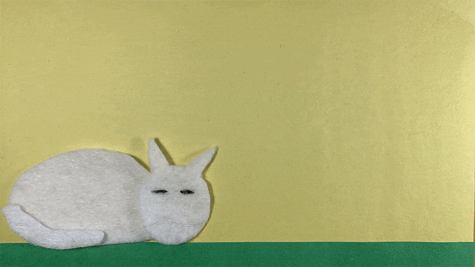
Linear Story: “A Bigger Purr-pose
My second story idea came a little bit from personal experience and from hearing about others’ experiences with pets during the early days of staying at home during the COVID-19 pandemic. Our pets were suddenly thrust into being our constant companions. On one hand they were a lifeline for mental health and companionship in a lonely stressful time, but on the other, their– especially cats’ – annoyance or confusion at our constant presence became a common topic of conversation.
“A Bigger Purr-pose” tells the story of a cat experiencing and adjusting to their owner suddenly being home all the time and the complications of this new situation. It’s told in a traditional three-act linear structure. First, the cat and its routine are introduced. Then the routine is interrupted by the owner’s need to work from the cat’s favorite napping spot and the cat must deal with the obstacles to its preferred lazy lifestyle. Finally, the cat realizes that happiness in life is about more than just naps and works out a compromise to support its owner and still enjoy some of the lazy life.
When coming up with this idea I’d always pictured a flat seeming world like a comic so at first, I thought about using paper cut-outs. However, inspired by the wool cooking animation in my research, I decided I wanted to add something softer to portray more of the warm and cozy setting of a home. I think felt would work well. I’m just worried about creating all the pieces necessary and figuring out the right scale to make them. I think, though, that the storyboarding process can really help with organizing and guiding this build work. For example, I’ve already been able to map out some preliminary color choices in my storyboards.
Compared to my other I idea, I feel more excited about bringing this story to life. It’s a story I’d really like to share with others. I like the mental health angle of its theme. The story feels entertaining, relatable, and relevant. I’m naturally more attracted to the arc of a linear story. And even if the technical process of using felt might be challenging, it feels like a challenge that could be fun.
Test Animation
Because of my interest in my second story idea, “A Bigger Purr-pose,” I did the test animation above of my story’s cat star being woken up by a person talking and then walking across the screen to leave while grumbling. It’s simple movement, but key to the story so it’s important to figure out if I can do it before pursuing further development. This also gave me a chance to work on lighting and experiment a little with my planned materials.
I decided to use an iPhone XR to shoot because I have a remote shutter control that works with it which allowed me to avoid touching the camera. I also found a free stop motion app called Stop Motion Studio that allowed me to shoot in 1920×1080 and could conveniently AirDrop a zip file of all my photos to my computer for editing in Premiere Pro.
Figuring out the camera set up and lighting was a little tricky and took some MacGyvering. I don’t have an arm for my tripod, but I needed to shoot from above as I arranged my cat and set on a table. To make sure its feet weren’t in the shot I had to lay my tripod on a stack of books with a bag of rice for a sandbag on top of it and the phone hanging above my set. It took a little back and forth to get my book stack just the right height for my shot’s framing.
I then attached a string from the tripod’s phone mount to the light fixture above the table to support the weight of the camera and ensure the shot was level. It looked a little ridiculous, but it worked and I’m glad I took the time before shooting the full piece to work it out. I feel a lot more prepared.
The lighting was provided by 2 desk lamps on either side of my shot. It’s not as even throughout as I’d like, but I think that’s my fault. I need to be sure that I’m always back in the same position before I take the next photo or else I can cause some uneven shadowing.
I’m also really glad I took the time to mock up the felt cat. I think the material works well. I learned I needed to sew its legs to its body to get more consistent movement when walking because in my initial take it was hard to control such small pieces when they were completely free.
I didn’t have enough felt yet to do a felt background set as well, but I hope the added friction of felt on felt will help me make more purposeful movements with the elements. The paper background was a little too smooth and I had to be careful when moving one part of the cat not to accidentally move the whole thing a lot. I did a test with 2 smaller pieces of felt and they offer more of the cling support that I think could help with this problem.
The last thing that this test was useful for was helping me realize how much I need to pay attention to natural movement in order to mimic it. The cat walking in my first take looked weird and choppy and after watching my own cat walk around some, I realized the order of movements I was using wasn’t correct for her locomotion.
Besides making sure I choose the correct motion for objects, the only other thing that may be somewhat difficult about shooting and editing is just timing out shots so that important beats stay on screen for long enough to land with the viewer before the next action occurs.
Reflections
Overall I can’t imagine going into the shoot of a fully animated piece, especially stop motion, without doing this pre-production work. I feel like I’d be wasting so much time, missing so many opportunities, and end up frustrated. Pre-production was definitely a lot of work, some tedious and some fun, but all necessary.
I now have my pre-production summary to keep my story on track, my storyboards to reference in the building of my set and character elements, and in creating my shot list, and my test animation experience to guide the technical logistics of shooting my first full story in stop motion. Time to finalize my story choice and head into production.