Summary
Having completed my journey through Animated Storytelling: Simple Steps for Creating Animation & Motion Graphics with advice on how to network and market your work once it’s done, I decided to take on building the type of content that sparked my exploration into animation in the first place. See and learn how I built a branded social media PSA on voting and a series of accompanying GIF stickers using the full spectrum of Blazer’s book, research examples of advanced and interesting animation techniques, and experience from my past 6 posts on motion design.
Reading & Writing
Once you’ve finished building your animation and put the final touches on it you might think your project is finished. But, really, this is just the start of another critical phase. Doing animation for your own interest and enjoyment is great, but you probably have more goals for your work. You want people to see it, like it, and talk about it. This takes work, just like it took work to learn animation techniques, best practices, and technology.
Liz Blazer dedicates the final chapter of her book Animated Storytelling: Simple Steps for Creating Animation & Motion Graphics to advice on how to share and network your animated projects. The environment for finding success right now, she says, is both advantageous and challenging for creators. On one hand, there’s never been as many ways to get your work discovered – social media, websites, festivals, etc. – but, on the other hand, this means there is more competition than ever, so you better be prepared.
Getting your work seen by the right people requires doing 2 kinds of work: packaging your project and creating your network. Packaging is essentially getting the marketing materials for your project ready. You need to sell your work so it should look good and be clear about what it is to whoever encounters it. Returning to the pre-production work you did and re-examining things like your elevator pitch and tagline can be a good start for this.
Blazer recommends that you should create the following assets for your project:
- Title Logo and Still
For inclusion in a range of promotional materials create a logo with the title of your project and choose a still photo from your piece. - Synopsis
Write a clear 2-3 sentence description of your project that can be quoted and used in a variety of sources. - Director Bio
People will want to know who made your project after they discover it, so have a bio prepared. This should include what title you want to be known as (director, animator, etc.) and your previous accomplishments related to this role or something interesting about yourself if you’re new to this type of work. - Story of the Film
For interviews, write and memorize the story of your project, starting with why you wanted to make it and why there’s a need for it.
Once you have these assets it’s time to put them to work, which requires you to create a network. Doing so can take 2 forms, either in-person or online. Even if you have a significant preference for one over the other they both are needed to give your project the best shot at success. Either direction can help you promote a project or find more work.
The in-person approach at industry events and in other settings can seem stuffy or anxiety-inducing, but in a digital age, it’s still helpful. Blazer recommends that while being professional is always necessary you shouldn’t hide who you really are for this traditional form of networking. Being yourself can help you stand out in a good way and get attention for your work.
For online networking, you need to find and participate in communities of artists, creators, and professionals related to the kind of work your do or the specific project you’ve created. You can blog, post, and share in these communities to build relationships, but when it’s the right time to share about your project be sure to give only enough to pique people’s interests. You want them to ask you more about it not be overloaded with information and tune out. And even if these interactions are online and feel informal remember to always interact with professionalism and respect just as you would in-person.
This phase of your project may seem like far less fun work than the others but you’re still a creator working in the medium of imagination: animation. You need to keep this perspective in mind. Even while professional you’re still an artist and a storyteller at heart. Blazer ends her book with a list of quotes she believes are applicable to the journey she’s just taken her readers on. One stands out as being a particularly appropriate attitude about work in general for animators to remember:
“Work? It’s just serious play.”
– Saul Bass
Research to Inform
When you’ve finished a project and are trying to share it, Blazer says it’s important to also keep your focus on the next creative opportunity. So, even though I’ve finished working my way through her book and have successfully completed 6 animations projects in my last 6 posts I’m continuing on to another new one, which means looking for more inspiration.
1. This animation is inclusive of so many different styles from watercolor to pen drawings to stop motion and even scenes that look realistic enough to be video footage, but it uses innovative transitions to beautifully and seamlessly move between them aided by Obama’s voiceover and the background music. Of note, is how the words “fired up” are animated to subtly look and move like fire. It’s such a simple style of kinetic typography yet it works very effectively to convey quickly the emotion of that phrase.
2. This might just be a lyric video, but the splatter style of the typography animation is so evocative of the song and of individual lyrics that it feels more like you’re watching a story rather than just words appearing onscreen. For example, how the splatter effect is used on certain words like the red “hurt” and the black “dirt” adds an extra layer of emotional meaning and impact to those. I especially like how the animators chose to not to write the word “explode” onscreen, but instead have a red splatter happen right over the word “head” reflecting the lyric “make your head explode.”
3. Having done social media advertising I can attest to how important it is to understand the analytics you get on those platforms to make sure your goals are being met. This explainer video does a really good job of doing that for Spotify’s advertisers through a combination of data visualizations, kinetic typography, and UI animations. How the text animates in to fill the screen and transitions in and out of the shapes and UI animations is really well done. I also enjoy the slot machine and sideways slide motion of the text and how the dot data animations change with the numbers and data points shown in the on-screen text.
4. This is another video from Spotify, this time from their “I’m with the banned” series. Besides the opening title there are no words in this animation. It instead uses representative images to illustrate the main points of Halsey’s voiceover connecting the history of strange demands from touring artists with the subject of bathroom access for transgender and genderqueer individuals. The morphing effect used to transform all or part of each of these images into the next is not only impressive but integral to the storytelling and technical success of this video.
5. I have to admit a little bias with this animation because I’ve met the singer/songwriter of this song and talked to him about why he loves using animation like this for his music videos. It really does help them stand out and add another storytelling element to his already story-based lyrics.
This one for “The Lion” is particularly notable because it uses 2D digital animation to create a 3D stop motion style that looks like an old toy theatre made of cardboard. It’s kind of insane how they managed to do this. Some of the cardboard cutouts were physically built, photographed, and imported into After Effects while other cutouts were digitally built, but I can’t really tell what’s what, especially with the amazing composition of the shadows and lighting. It was a really inventive animation process that they used to create this and the animator does a much better job than me of explaining it here if you’re curious.
Create
When I began this exploration of animation I had 2 ambitions: learn to make cool typographical based animations and create sticker GIF animations. For my work in marketing and social media, I’ve created a lot of different kinds of content but not these 2, despite my interest. Doing them well meant having a good handle on the animation process – of which I didn’t before reading Blazer’s book – and knowing how to use After Effects with some level of comfort – of which I’d never had to the time or motivation to do until now.
However, after finishing Animated Storytelling and successfully completing multiple projects with After Effects I figured it was time to go after my goal and see what I could do. That’s how I came to make the social media voting PSA seen below. Since I will mostly be applying my animation skills to my professional work, I used the branding of the organization I work for – Quinnipiac University – to make this project more realistic to work on.
This video is made with a square (1:1) aspect ratio optimized for intended used on social media platforms like Instagram to reach the university’s community and encourage voting. Below you will also see a series of accompanying sticker GIFs for publishing on GIPHY and for both public and brand use on various platforms to support this voter participation campaign
Creating this project took a lot of work, but I kept in mind the animation process laid out in Blazer’s book and her advice on breaking big projects up into smaller pieces to approach this.
I started by brainstorming ideas for my individual GIFs. Then, knowing I wanted most of my GIF animations to appear in my PSA, I created a basic storyboard and script for the video around incorporating them. I used this same approach of focusing on smaller elements and progressing up to the overall project when building in After Effects. I started with compositions for each of the GIFs, moved next to the sections of my video where each GIF animation was going to be integrated, and finally pulled all these compositions into a final main composition.
At this point, I just needed to focus on creating transitions from one section into another. I was specifically very interested in tying transitions together with color to make the whole piece flow fluidly. For example, I used position keyframes to shift up the ballot box shot to reveal the same color blue background for the “Are you?” shot. To create the transition that zooms into the blue “3” and out of the blue ballot box I had to use the 3D option on both of those layers and scale up and down with keyframes on the Z-axis.
Working with kinetic typography turned out to be both easier and harder than I’d anticipated. Building it was much more straightforward than I expected. Most of the typography you see in this project was made simply with basic position, rotation, opacity, and scale keyframes as well as a few instances of parenting groups of words to null objects for coordinated movement between elements.
Editing with kinetic typography, though, was a little trickier. I quickly learned that one small change in position or scale of one element can throw off the entire composition and leave you hunting to figure out what keyframes need fixing to get back on track. Working out the timing for transitions also had me going back and redoing work to get things coordinated again.
I knew I wanted the video to have an informational, but upbeat tone to it and I had some music ideas before animating, but I ended up having to look at a number of free stock music options with my roughly finished video to make a choice. Making my choice and then getting the timing of the animations coordinated with the audio as well as everything else meant making small changes in position or length of layers which then threw things off again. Kinetic typography can be a precariously balanced ecosystem to work in. My best advice is to have a plan, but be very patient when you inevitably need to experiment or polish.
Below are the GIF stickers to go with the PSA. Each of them was created using a slightly different technique.

The animation of the arrow here was created by using the trace path function on the arrow path I created with the pen tool. Trace path creates a null layer with keyframes that do just what it says: trace the path. I then added a trim path animator onto my path layer. In the animator, I held the option key and clicked on the “End” stopwatch to add an expression and parented “End” to “Progress” on the trace path null.
I also created a 3-sided polygon shape layer for the arrowhead and parented it to the trace path null while holding shift. Doing this allows the shape to receive both the position and scale of the null and follow the same animation as the arrow path.

This animation of the depositing ballot was really simple to achieve. I created a rectangle shape layer for the paper and a path for the checkmark. I then used position keyframes on both to lower it down. To make it look like it was going inside the box I grouped them together into a pre-composition and applied a rectangle inverted mask to hide the ballot after it passed a certain point. All it took then was placing the ballot in a position where the disappearing point was over the ballot slot.

To get this kinetic typography style I first created separate text layers for each of the words. The first 2 words only required coordinated position keyframes to make it look like one was pushing the other up. The same thing happens with “Roar” when it comes in, but to add the shaking I applied a skew animator to the layer, adjusted the settings to my liking, and added keyframes to “Offset” to get the kind and length of movement I wanted.

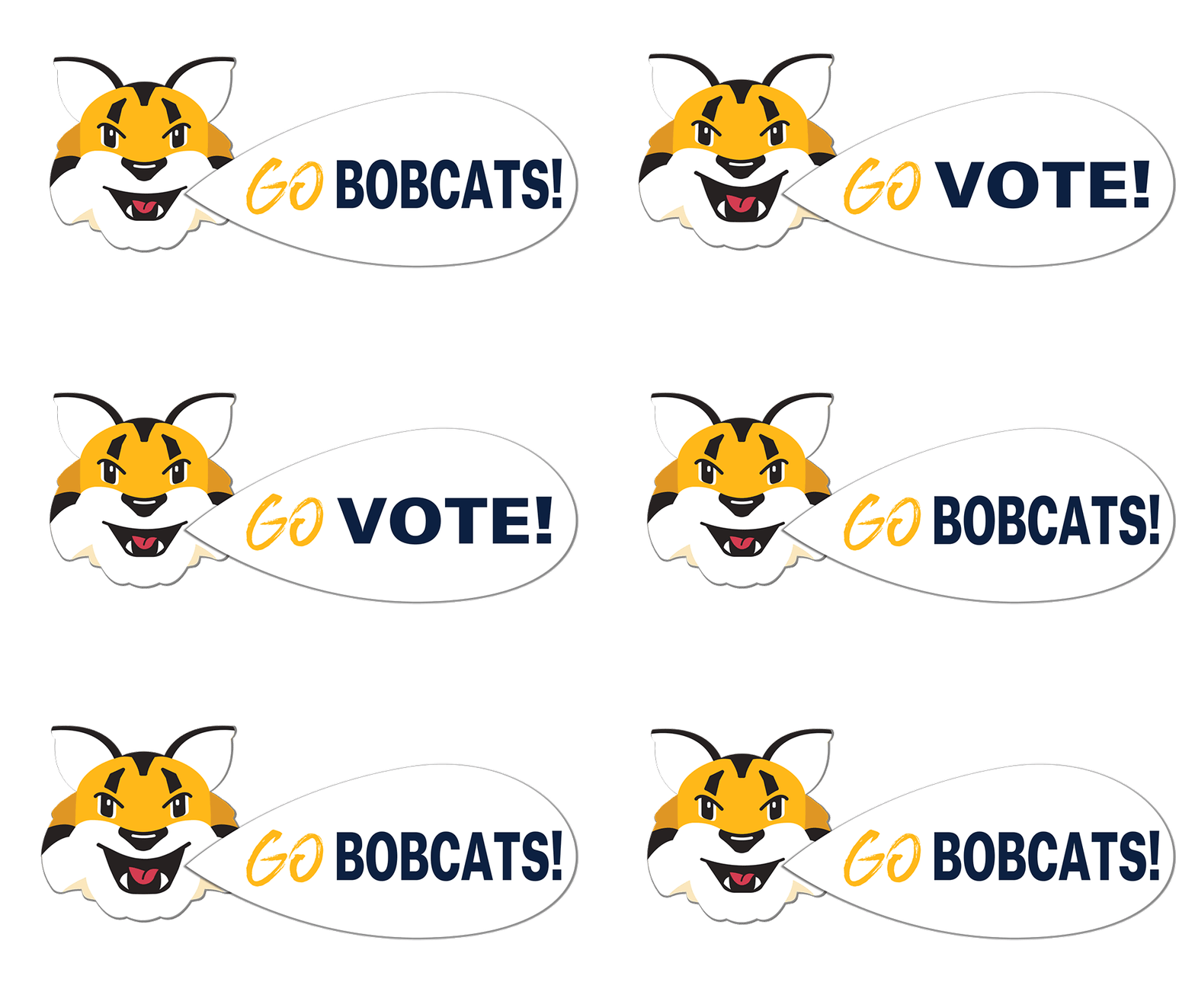
This animation uses both the technique of text layers “pushing” each other up with position keyframes as seen in the last GIF and masks, as seen in the ballot box GIF, to hide the words when not in the center of the word bubble. To achieve the roaring Bobcat I used puppet pins like I did with my previous UI animation. I placed them on either side of the mouth to open it wider then return it to normal and pins on either side of the face to apply the squash and stretch principle to make it look more realistic.

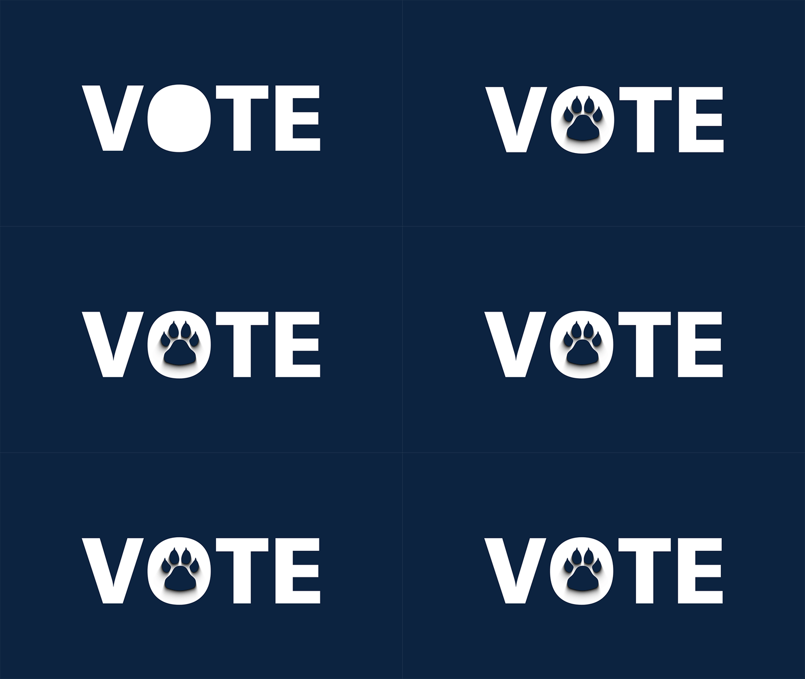
This animation makes use of 3D in After Effects just as some of the transitions in my PSA do. To get the paw print coming in to stamp the word I placed keyframes on the Z-axis of the layer pretty close together. With the help of motion blur, which was applied to almost all the moving elements in this project, it easily gives the effect of the paw print rushing in from the foreground.
The reaction shake of the word to the paw landing was made by applying the wiggle – position preset to the text layer. In the effects controls for this preset I adjusted settings to get the movement look I wanted then added 2 keyframes on “wiggle speed” to start and stop the wiggle to be just the jolt you see here.

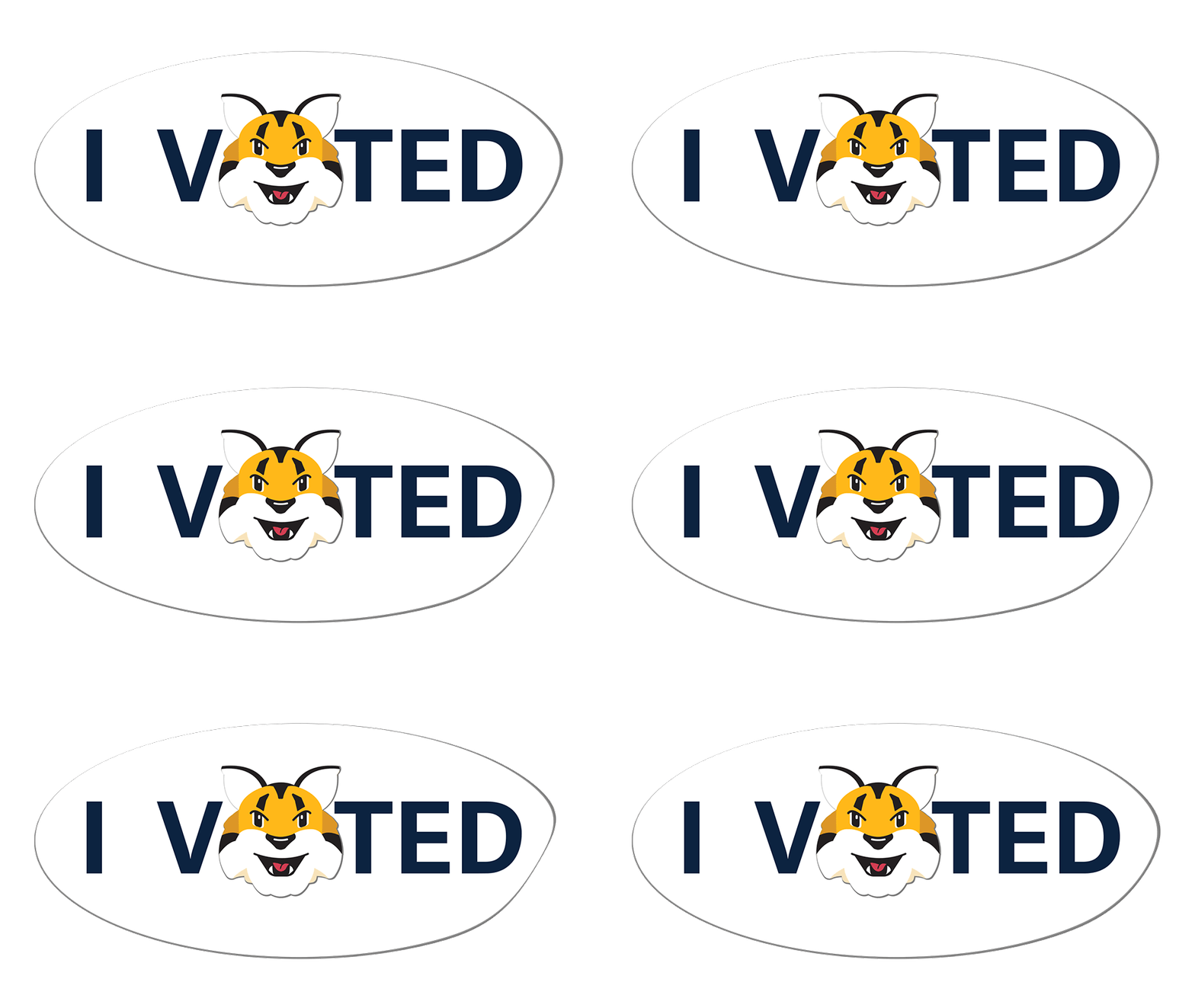
The effect of the fluttering edge on this “I Voted” sticker GIF was created using the CC page turn preset with controls set to “classic UI” and placing a number of keyframe changes in quick succession on “Fold Position.” This preset naturally makes a layer look transparent when folded up so I had to do a couple of things to solve that.
First, I adjusted opacity to 100% in the preset effect controls. Then I duplicated the entire pre-composition that my sticker was built on and that CC page turn had been applied to. In this new duplicate, I turned off all layers except the white circle shape layer. In my main composition for this animation, I turned off this duplicate layer and then went back into the effect controls for CC page turn on my original pre-composition, and under “Back Page” chose the duplicate pre-composition. This made the background of the sticker solid if it’s shown. I ended up not needing this as much as I thought because of how subtle my movement is, but it was good practice building this should I need it for another project.
Reflections
Some of the techniques described above I’d learned from working on previous projects and some I had to find YouTube tutorials on. No matter how good I get at After Effects there’s always going to be something my head can dream up that I don’t have a clue how to approach building so Google will probably remain my creative partner for animation. This experimentation and learning is part of the fun of animation, but also another big reason to have patience working on these types of projects. You never know when you’ll need to stop to research and learn something.
Here’s to learning more and doing more. Looking at this project it’s almost hard to believe I finally achieved the animation goals I’ve had for so long. Instead of feeling like I’ve completed something, though, I feel like I’ve just begun. I now know enough, as they say, to be dangerous.
I’m already starting to naturally work out in my head how an idea or look might be achieved before searching for advice. I imagine this can only lead to being curious about more and more complicated techniques and attempting more and more complex projects. Motion design and animation really feel like an endlessly building journey. All I need now is my next idea.
