
Over half of the internet traffic in the world now comes from mobile devices, such as phones and tablets. But for most of the history of the internet web design has been done from the perspective of the traditional desktop. As the mobile revolution developed over the last decade, designers and programmers suddenly had to worry about supporting an ever-increasing list of devices and screen sizes.
At first, the solution seemed to be to design unique experiences for each – i.e. mobile websites. While mobile websites may have their advantages, it’s not always practical to spend resources building and maintaining 2 or more sites usually containing similar content. Plus, every new device introduction threatens the need for a redesign to keep up with the market. Instead, a leading school of thought became designing one site to rule them all, or responsive web design (RWD).
What is Responsive Design?
Responsive web design was created by web designer Ethan Marcotte in 2010 as a flexible or fluid design style in which content on a webpage rearranges and resizes itself according to the size of the screen or the size of the browser it’s on. This creates a seamless cross-device user experience and future-proofs a design. RWD is accomplished by using CSS (cascading style sheets) that can detect the screen dimensions of a device and apply predetermined rules for those dimensions of how the content should appear.
Usually, design shifts will be determined by breakpoints. These breakpoints are defined as the minimum and maximum screen width in pixels for a particular layout. Once a viewport is above or below the designated width, a layout change is triggered. A responsive site will normally have 3 or more breakpoints. You can see in the video above a few examples of how decreasing your browser window shows the fluid transitions of responsive design.
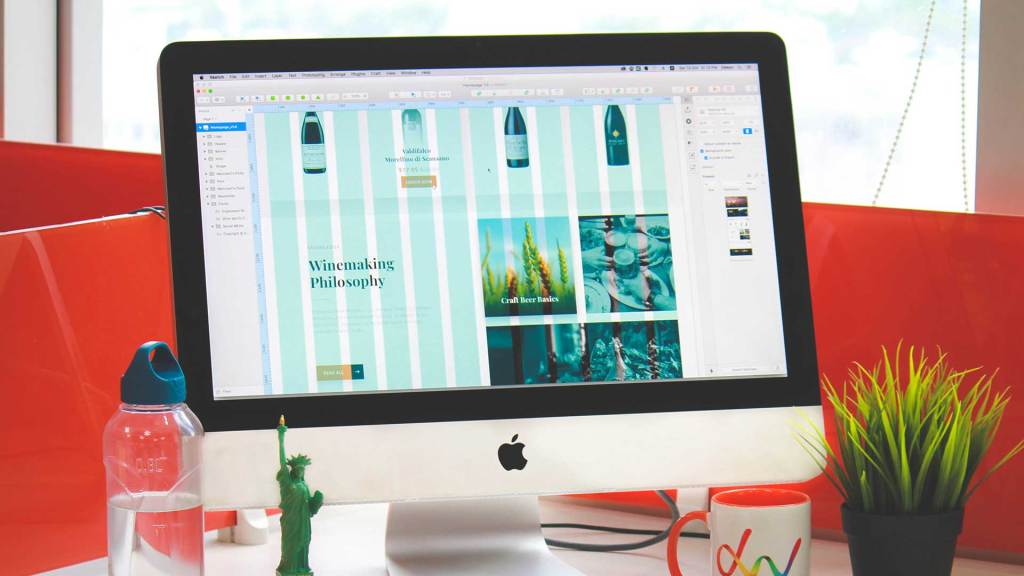
Because of this, a responsive site’s design benefits from using a grid system. Designing with a grid means dividing the screen into a number of equal columns and rows, as seen in the photo above. Each of these is defined as taking up a certain percentage of any device’s screen. Common responsive grids have 1, 2, 3, 6, or 12 columns, and elements in a layout can take up as many columns and rows as you want.
This grid is then translated into the CSS for a page to help determine the different breakpoints and layouts across devices. There are a few ways to implement a grid in CSS, but CSS grid is the newest and increasingly popular layout system for this and the first one created with responsive design explicitly in mind.
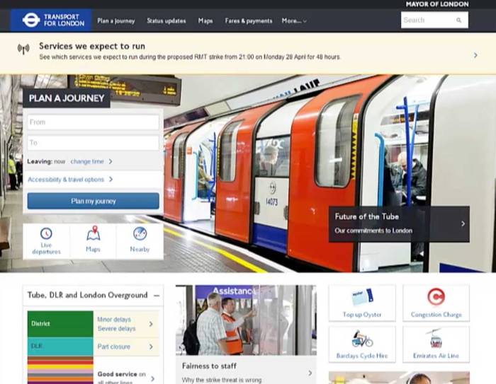
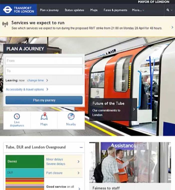
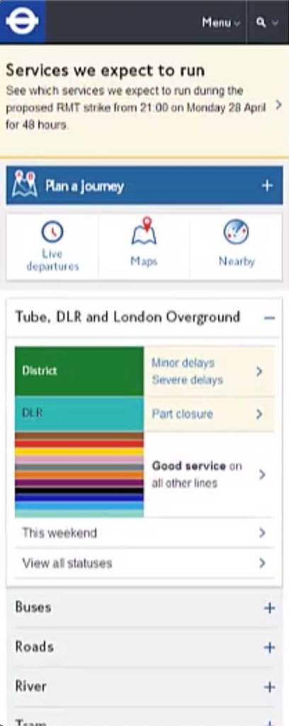
Designing with a grid allows you to better and more consistently organize elements on a page and seamlessly translate your design to different device sizes. For example, a desktop layout may have 12 columns which reduces to 4 columns for tablets then 3 columns for phones. Visibly this may mean the content onscreen is shown in 3 vertical sections on desktop, 2 on tablets, and just 1 on phones, as seen below.
The HTML of a responsive site is the same across devices, unlike in adaptive design where multiple layouts with fixed dimensions will be designed and then only the HTML for the most appropriate one will be delivered to the device.
This difference in HTML delivery means that RWD can sometimes cause longer load times that can negatively impact the user experience of a site on mobile devices, exactly the opposite of the design style’s purpose. However, with testing and strategic design decisions you can avoid this problem.
Even though the flexible nature of RWD gives you less control over what the exact appearance of a site will be on a specific device, it is preferable in comparison to adaptive design because it’s less work. You don’t need to build multiple designs, just some extra CSS. Plus, there are a lot of CSS frameworks, such as Bootstrap, available to use to build a responsive site. A framework is a pre-built code structure that helps you build faster while solving known problems – basically a shortcut or a template so you don’t need to code everything from scratch.
What to Consider In Responsive Design
RWD isn’t perfect and thus there’s no exact approach to designing the optimal website. However, there are some guidelines you can follow:
- Design mobile-first
It can be tempting to base a site’s layout on the desktop view first and work down in screen size. However, starting with the smallest screen first and working your way up means you will identify and tackle design problems earlier, making it more likely your finished design will be able to adapt well to all devices. - Prioritize content
There’s a lot more space at the top of the page for content on desktop, but not so much on phones. Consider what your users’ needs are on different devices and order content to appear accordingly. You may even want to consider hiding certain content on smaller devices if its effectiveness is lowered with screen size or if it may otherwise hamper user experience through the page’s performance. - Ensure usability
Responsive design isn’t as simple as just rearranging content by device. It also sometimes requires you to resize content to support usability. For example, buttons on devices with touch screens may need to be bigger than on devices with traditional cursors – even if the screen on these touch devices are smaller – in order to make the buttons easily clickable. User testing with multiple device types is the best tool to identify and fix usability problems like this. - Facilitate design and development collaboration
RWD isn’t an exact science and problems or obstacles to good user experience can occur on both the design and development sides. A successful responsive design requires that designers and developers communicate clearly and work closely together throughout a project to make the best decisions for how a site will appear on different devices. It’s no longer a simple baton pass. A designer’s work doesn’t end when development begins.
Good Design is responsive design

Because you’re juggling at once the parameters of every device your users will ever use to access your site, responsive web design can feel like a lot of work. But it’s better to think of it like a maze or puzzle that you must work through to get to a more desirable, usable experience.
In many ways, the purpose of web design is to help users and the definition of a good design is one that accomplishes this purpose. Well, users today have made the design process a little more complicated with all the different devices they have. But, if your goal is to create good design, then it shouldn’t be hard to motivate yourself to tackle a responsive puzzle.
References
Cao, J. (2020, April 22). Best practices & examples of excellent responsive design. UXPin. Retrieved from https://www.uxpin.com/studio/blog/best-practices-examples-of-excellent-responsive-design/
Kirkwood, J. (2018, February 26). 11 powerful examples of responsive web design. InVision. Retrieved from https://www.invisionapp.com/inside-design/examples-responsive-web-design/
Martin Garcia, J. (2019, February 26). Look ma, no media queries.! Responsive layouts using CSS grid. CSS-Tricks. Retrieved https://css-tricks.com/look-ma-no-media-queries-responsive-layouts-using-css-grid/
Percentage of mobile device website traffic worldwide from 1st quarter 2015 to 2nd quarter 2020. Statista. Retrieved from https://www.statista.com/statistics/277125/share-of-website-traffic-coming-from-mobile-devices/
Responsive design. Interaction Design Foundation. Retrieved from https://www.interaction-design.org/literature/topics/responsive-design
Schade, A. (2014, May 4). Responsive web design (RWD) and user experience. Nielsen Norman Group. Retrieved from https://www.nngroup.com/articles/responsive-web-design-definition/
Responsive web design – frameworks. W3Schools. Retrieved from https://www.w3schools.com/css/css_rwd_frameworks.asp
Responsive web design – grid-view. W3Schools. Retrieved from https://www.w3schools.com/css/css_rwd_grid.asp
Soegaard, Mads. (2019, July). Adaptive vs. responsive design. Interaction Design Foundation. Retrieved from https://www.interaction-design.org/literature/article/adaptive-vs-responsive-design
Soegaard, M. (2020, July). The grid system: Building a design layout. Interaction Design Foundation. Retrieved from https://www.interaction-design.org/literature/article/the-grid-system-building-a-solid-design-layout