As a kid, I dreamed of going to Disney World, a magical place where I’d ride in teacups, get autographs from cartoon characters, and watch fireworks every night over a fairytale castle. Unfortunately, I haven’t made it there, yet.
But when Disney Plus, the company’s streaming service, launched last November, I was intrigued by the possibility of adding some Disney magic to my life again, if only through the TV and movie content I’d loved as a kid. That content has proven as satisfying as I remember, but the Disney Plus experience has left a bad taste in my mouth.
Design = experience = emotion
I’ve found myself comparing Disney Plus to Netflix often. “Why doesn’t it have this feature or that function?” “Why does it or doesn’t it do this thing Netflix does?” So much of the speculation about who will win the streaming wars has focused on who has the more desirable content that the conversation about the overall experiences of these services has been overlooked.
Positive user experiences are not limited to content. They are also highly affected by the design of the container for that content. As I explored in my last post, emotions are integral in the decision-making process. I may get the feels for Disney Plus because I can watch 101 Dalmatians or for Netflix, because I can watch Gilmore Girls, but being able to find these content items or easily discover the play button to watch them can also give me the feels. If these elements of a website are not designed well, with the user’s needs in mind, then the whole experience can be ruined.
Design affects emotions and emotions determine the bottom line. Research has found that good user interface (UI) design—the more aesthetic elements of a site like color, font, images— can increase conversions by 200% and good user experience (UX) design—the more functional elements like label, navigation, readability—can increase conversion by 400%! Design is not just a nice to have in the form of pretty packaging, it’s a complex need to have.
Designing the user interface and user experience of a website requires understanding users. A no-brainer, right? To do this, you must understand the emotional motivations behind users’ behaviors. For example, have you ever stood in the cereal aisle of the grocery store and felt overwhelmed? I have. I’ve had a wall of colorful boxed breakfast treats at my fingertips and gone home empty-handed.
As psychologist Barry Schwartz explains in the video above, this problem is called the paradox of choice. The designers of a streaming service website may want to be concerned about this because streaming services often pride themselves on having large libraries of content options. Too many options that all seem equal, though, cause stress to the point where some users will not take action.
If you can never decide what to watch, you’re probably not going to continue subscribing to that service for very long. To prevent this problem, designers need to create ways that narrow down the content options presented to users without limiting their overall access to the larger library. They often do so through genre-based menus or recommended content lists.
It doesn’t matter, though, how good a designer thinks a design is. It only matters how that design makes a user feel. If, for example, users reacted to a streaming services’ recommended content list by saying, “This list makes me feel overwhelmed and stressed because my need for direction, focus, and certainty are not being met,” then the design was not successful in its goal.
Discovering my feelings about netflix
In order to discover if my negative opinion of Disney Plus is related to its design, I examined my feelings about 10 different UX and UI elements of the website through the FEELS and NEEDS structure I used above. I also examined Netflix’s website this way in order to see if my praise for it was accurate or just bias from years of use.
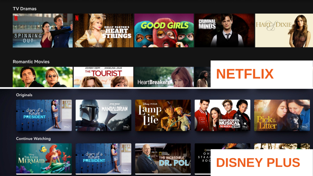
At first glance, both websites looked strikingly similar with horizontal menus of content represented by images on a dark background. However, as I examined detailed elements a pattern started to develop. Netflix has many of the features and functions I’ve come to expect as standard on streaming services: genre-based content menus, robust search, easy to find content descriptions. Overall, the website makes me feel understood, supported, and relaxed because my need for discovery, ease, and efficiency are being met.
Many of the elements I felt positive about on Netflix I had never consciously thought about before, such as the progress bar on the horizontal content menus or how every play button is red.
Well done design is easy to miss because it makes your experience easy. This idea is referred to as presence-at-hand. There’s no problem that stops you in your tracks and causes you to take note of these design elements. While invisibility is not something necessary for good design, crickets can often be a sign you’re doing things right. As a result, Netflix took longer to analyze and find specific elements I had feelings about because most of my feelings ended up being positive and harder to put words to.
DISCOVERING My Feelings About Disney Plus
Disney Plus, on the other hand, was quick to analyze—not a good sign for the website. It has some good features I discovered, but it has a ways to go to catch up to Netflix in terms of UX and UI. Overall, the website makes me feel frustrated, confused, and fatigued because my need for ease, learning, and discovery are not being met.
The search tool was the feature I had the most negative feelings about because not only had I been conditioned to expect a higher standard for these from Netflix, but Disney Plus’ design in this area felt antiquated and like an afterthought.
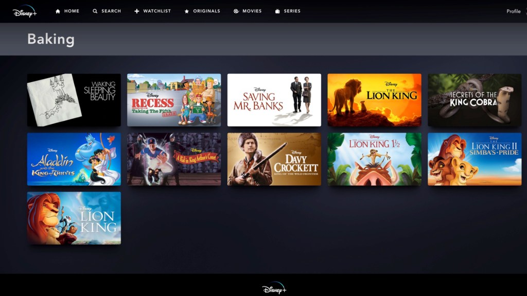
Search results are not organized by any logic—alphabetization, production date—that I can discern. Sometimes if I search for something not on the platform it will just give me a blank page with no results. There is no feature suggesting related content so it’s just a dead end. Other times when I search for something not on the platform, as in the image above, it comes up with bizarre, illogical results. Somehow I get The Lion King movies when I search for “baking” but not for when I search for “cats.”
I love Disney’s content, but I find Netflix offers an experience that makes me believe they care about providing quality rather than just riding on their name and a legacy of content that elicits nostalgic feelings from me.
I felt sad and disappointed coming out of this exercise because I really wanted to like Disney Plus and was hoping I was just unconsciously biased against something new. I would think a company like Disney, so well-known for designing experiences that elicit positive feelings, would design a good streaming experience, but that’s not the case when compared to the designs of streaming giant Netflix.
Reflections
My emotional analysis of Netflix and Disney Plus shows that even being one of the biggest names in entertainment does not exempt you from needing good UX and UI design in order to inspire positive emotions.
Doing this exercise made me realize that a website’s design is only as good as its weakest parts. So many UX and UI elements work in tandem to help users feel certain ways and form certain opinions. The color, size, and font of movies’ descriptions can make me feel supported in making a content choice just as much as a search feature that offers logical and helpful results.
If a user can see or interact with a website element, then it has the power to influence their emotions and emotions affect everything from brand sentiment to conversions. In other words, never assume something doesn’t matter to a user. It does and it must be designed to meet their needs.
Disney would be wise to heed this advice as the streaming wars heat up.
References
Goyal, M. (2019, February 7). Combining UX design and psychology to change user behavior. Medium. Retrieved from https://uxdesign.cc/combining-ux-design-and-psychology-to-change-user-behaviour-39d27730434a
Paunovic, G. (2017, March 23). The bottom line: why good UX design means better business. Forbes. Retrieved fromhttps://www.forbes.com/sites/forbesagencycouncil/2017/03/23/the-bottom-line-why-good-ux-design-means-better-business/#787831ad2396
Safer, D. (2016, November 12). The myth of invisible design. Medium. Retrieved from https://modus.medium.com/the-myth-of-invisible-design-c67d590babe9
St. Leger, H. (2019, November 14). Disney Plus vs Netflix: who will win? Tech Radar. Retrieved from https://www.techradar.com/news/disney-plus-vs-netflix-who-will-win
Weinschenk, S. (2016) 100 more things every designer needs to know about people. San Francisco: New Riders.