
You’ve probably heard that life is about the journey, not the destination. The same is true of user experience (UX). Businesses love to collect data on their users—site visits, email opens, social media engagements, conversions, purchases. These numbers show what actions users take, but they don’t tell the story of how users came to take those actions.
The story, or journey, of a user, is important because most of the time you don’t just go and do something. As the video below explains using the scenario of getting coffee, there are far more steps to each experience you have than you consciously recognize.
As you pass through each of these steps, you are motivated, influenced, nudged, and persuaded by many forces, such as your social circle, your emotions, your schedule, the advertising you are exposed to, the weather, the traffic—you name it, it can be part of you’re user journey.
For businesses, it’s important to know the points in a user’s journey that they can influence or need to consider in order to provide the best user experience possible. Journey maps are a great visual and shareable tool for understanding this important information.
What are Journey Maps?
User journey maps, sometimes also referred to as customer journey maps are visual representations of the story of a user’s relationship with a brand, product, or service. As the design thinking process requires, journey maps must tell the story of the experience from the perspective of a user. This story should be complete, from the first interaction to a committed relationship, and include interactions across channels.
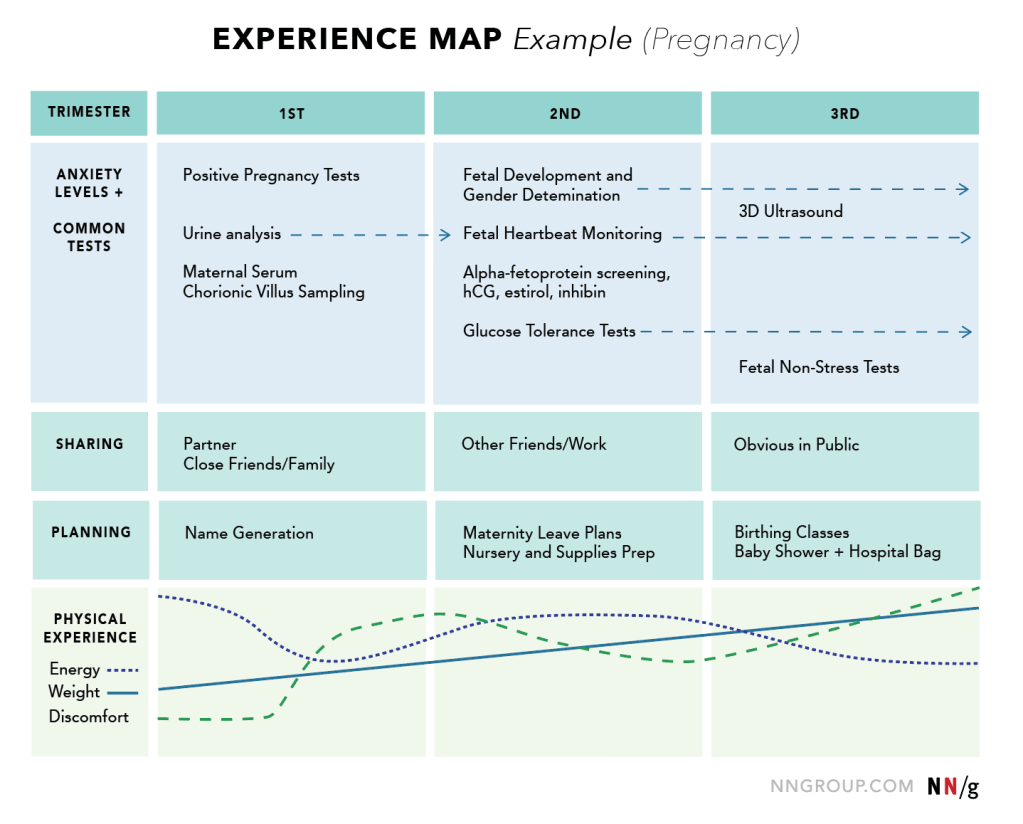
Sometimes journey maps can be confused with experience maps. Experience maps are about showing each step in a generic human journey of an experience that is not specifically related to a brand, product, or service.
They can be helpful for understanding how something may fit in a user’s life but are not focused on business or product interactions. For example, you can see an experience map for pregnancy created by Nielsen Norman Group below.
Journey maps, on the other hand, highlight a specific type of journey a specific type of user takes in order to achieve a specific goal related to a brand, product, or service. They are linear, from Point A to Point B, and focus on key touchpoints users have with a brand, product, or service. People from across areas in a business can benefit from using journey maps because they help people to understand, from the user’s point of view, the experience they contribute to creating.
Often a business will not coordinate a consistent experience across departments, employees, or channels because internally the business is very siloed in areas of responsibility and tasks. Journey maps show how, to the user, all elements are viewed as parts of a whole larger experience, rather than individual experiences unto themselves, as business insiders may be used to viewing them.
Marketing professionals are most likely to be familiar with journey maps, but other roles, such as designers, copywriters, customer support teams, and user experience (UX) designers can benefit from using them as well.
Journey maps can help UX designers specifically to answer “what if” questions during the design process and identify gaps or certain pain points in the user experience that need improvement. These commonly occur when users transition from one device to another or from one channel to another for interaction with a business, or when they must deal with different departments of a business for different steps in their journey.
Building a journey map
Journey maps tell stories because they include human elements of users, such as emotions and thoughts, rather than just data. Following the rules of the design thinking process, journey map content is based on your understanding of your users gained from user research, not from assumptions or intuition.
All journey maps will be unique in their design and content because each product, service, or brand will have unique parts and interactions in its user experience. However, there are some basic elements you should include to make a helpful journey map.
A Persona

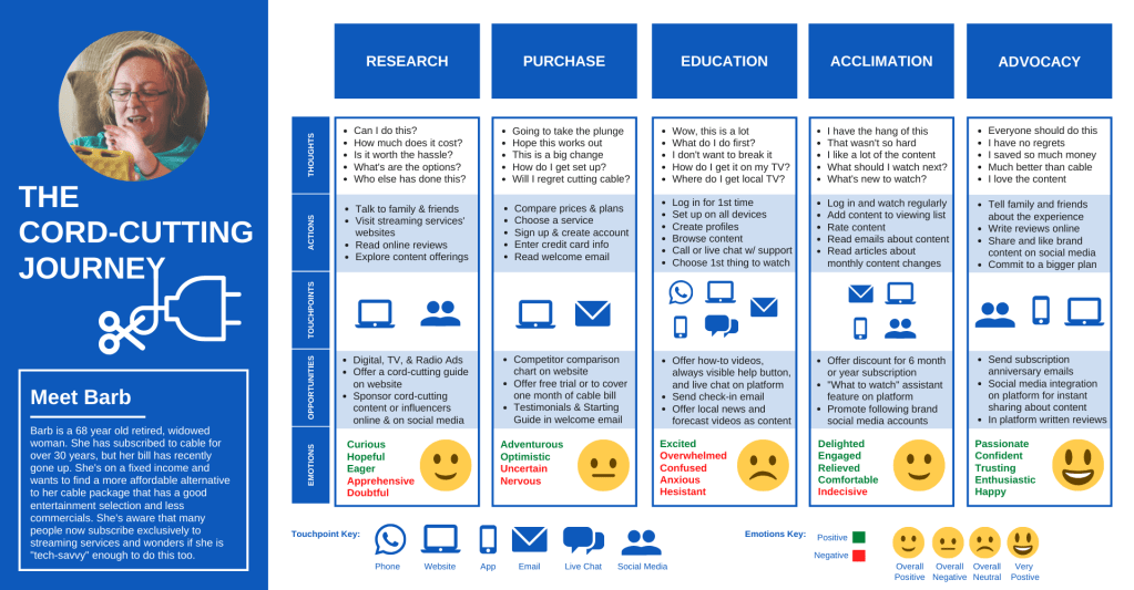
In a previous post, I explored personas – profiles of fictional people you create as a means of synthesizing and communicating the information you have collected about your users. The “who” that is having the experience outlined on your journey map should be one of your personas. My journey map above was created for “Barb,” a hypothetical persona I built to represent a type of Netflix user.
A Scenario

Since I named my “Barb” persona the Cord-cutting, Retired Baby Boomer, it seemed appropriate to explore the experience of becoming a cord-cutter from her perspective. Thus, my journey map displays the cord-cutting journey. All journey maps need to be about the experience of a specific scenario like this one.
Within my introduction of “Barb” on my map I explain how she has recently been triggered by an increase in her cable bill to consider purchasing a streaming subscription and becoming a cord-cutter. This helps to communicate why this user is on this journey and where they are starting from.
Phases/Timeline

The main section of your map should feature the phases the user goes through during this experience. For example, the phases I defined for the cord-cutting journey are research, purchase, education, acclimation, and advocacy. These phases should flow from a logical beginning to an end of the experience.
It makes sense that the first time a user who is considering cord-cutting would interact with Netflix would be through research and that, if this experience played out on the preferred path, it would end with a user becoming an advocate for the cord-cutting experience and for subscribing to Netflix.
User’s Actions, Thoughts, and Emotions
For each phase of your user journey, you should include information on the user’s actions, thoughts, and emotions during that phase. Emotions are one of the most influential forces behind why people make certain decisions, form certain opinions, and take certain actions. Having a user’s emotions in conversation with their actions and thoughts at each phase on a journey map is vital to understanding what an experience is actually like for them as they travel through it.
For each phase on my map, I listed the dominant emotions “Barb” would be having at that time. Then, based on the number of positive versus negative emotions, I assigned the phase, using a face icon, an overall emotion: very positive, positive, negative, or neutral.
Seeing the variance in emotion by phase helped me understand that the goals and approach for UX design focus may differ by phase. The research phase was majority positive for “Barb”, so any changes in the experience there should enhance, not detract from already successful elements.
The education phase, though, was overwhelmingly negative which made me think that UX design changes here need to focus on making the transition from purchasing a Netflix subscription to getting educated on it less of a scary and intimidating jump. This could be the phase of the journey where many users abandon their pursuit of cord-cutting all together because the challenge is simply too big of an ask.
The act of watching TV may be similar between streaming and cable services, but the actions you take in order to watch are drastically different. This is not a problem for all users, but for someone with no previous streaming experience or low confidence with technology, categories which an older cord-cutter like “Barb” would be more likely to fall in, this could constitute a major pain point in the journey.
From user research, I may have understood generally that making the cord-cutting transition would be difficult for her. Creating a journey map, though, helped me see where exactly this would be a crucial problem and what points of interaction could use UX design changes in order to help with this problem.
Channels and Touchpoints

Once you’ve included the actions, thoughts, and emotions of your user on your journey map, it’s time to plot out where and how they come in to contact with your product, service, or brand. A helpful way to discover all the interactions your business has with a user is to gather members representing departments across your organization together and have everyone identify what part of their work comes in to contact with users.
Interactions can happen via different channels in different phases of the journey. For example, “Barb” interacts with Netflix on its website during her initial research. Then she reads a welcome email from them after she purchases a subscription. When she’s learning to use the service, she asks for support over the phone or via live chat. Once she’s a regular user she logs in daily either on the desktop website or on the app. Finally, when she becomes an advocate for the service and the cord-cutting experience she writes reviews, shares or engages with content from Netflix’s social media accounts.
A user, though, can have more than one interaction per phase and they can interact with a business via multiple channels during the same phase as well. There is usually a basic flow of touchpoints all users travel through on their journey with a business, but not all users will actually engage with each touchpoint.
Being new to streaming “Barb” needs interactions with customer support via phone and live chat. Another type of user may never utilize customer support interactions at all on their journey. They may just log in, take 5 minutes to familiarize themselves and move straight to being a regular user because they have previous experience with this technology.
Because some of the phases on my map had many channels where interactions took place, I wanted a design that kept this part of my map easy to digest and visually appealing. I represented each channel with a unique symbol and included a symbol key for reference. (I did the same type of key and iconography for emotions as well.) You can, of course, also just list out the interactions a user has, the channels they happen via, and what area in your business is responsible for the experience of each of these interactions.
Opportunities
Aligning a user’s emotions, thoughts, and actions with their interactions with your product, service, or brand on a single document allows you to identify opportunities for improving the user experience. On my map, I’ve listed multiple opportunities for improvement during each phase.
For example, “Barb” is looking to learn about streaming service options and how to become a cord-cutter during the research phase. Creating a cord-cutting guide on Netflix’s website could make it a helpful resource for users like “Barb,” make the service stand out compared to the competition, and elicit more positive emotions. These positive emotions could be more likely to persuade “Barb” to move to the next phase and purchase a Netflix subscription because the user experience was supportive and provided exactly the information that she needed.
In the education phase “Barb” is overwhelmed with learning to use Netflix which causes overall negative emotions to be in control. Netflix has an opportunity to change these emotions by sending a strategically timed check-in email to “Barb” showing her that they care, understand the change might be a challenge, and reminding her that she is not alone in this transition, customer support is always available. This email could even include the name and direct contact of a specific customer support individual for “Barb” to contact for assistance and individualized tutorials.
An easy to spot, always present help button could also be added to Netflix’s website and app to improve the user experience for “Barb” in this phase. When she is logged in to her account but uncertain about what she should do at any point, she could be connected directly to searchable FAQs or to a live phone or text chat with customer support.
She wouldn’t need to switch devices or even search through a menu to access this assistance. The easier she can access information, learn it, and apply it as a user, the more likely she will have positive feelings about her experience with the service and continue on to the next phase of becoming a cord-cutter.
Journey Maps Show the Way

As you can see, a journey map can highlight many opportunities you may be missing for offering the best user experience possible. You can’t be with a user every step of the journey to shape how it goes. What you can do, though, is work to understand the journey from their eyes and create interactions that help to solve their problems.
A journey map’s ability to tell the story of a user’s experience in a memorable and concise way makes it a valuable tool for creating a shared vision of the overall experience your business wants to offer and for guiding your UX design decisions.
References
Boag, P. (2015, January 16). All you need to know about customer journey mapping. Smashing Magazine. Retrieved from https://www.smashingmagazine.com/2015/01/all-about-customer-journey-mapping/
Gibbons, S. (2018, December 9). Journey Mapping 101. Nielsen Norman Group. Retrieved from https://www.nngroup.com/articles/journey-mapping-101/
Gibbons, S. (2017, November 5). UX mapping methods compared: a cheat sheet. Nielson Norman Group. Retrieved from https://www.nngroup.com/articles/ux-mapping-cheat-sheet/
Goddard, P. & Hoski, K. (2015, June 17). 5 essential components of effective customer journey maps. TandemSeven. Retrieved from https://www.tandemseven.com/journey-mapping/5-essentials-for-customer-journey-maps/
Grocki, M. (2014, September 16). How to create a customer journey map. UX Mastery. Retrieved from https://uxmastery.com/how-to-create-a-customer-journey-map/
Kaplan, K. (2016, July 31). When and how to create customer journey maps. Nielsen Norman Group. Retrieved from https://www.nngroup.com/articles/customer-journey-mapping/