
Think about walking in a library to look for something to read. The stacks are organized into categorized sections—fiction, nonfiction, periodicals, etc.—and each item is alphabetized, assigned a corresponding call number, and shelved in numerical order in each section. You are always free to wander and explore the stacks, but if you are looking for a specific genre, author, or book, this system makes it pretty quick and easy to find what you want.
Library science is the study of how to categorize and catalog information resources. In simple terms, you group resources by similarities, then create and assign metadata to content in order to be able to find it easily again. You’ve probably never made the connection, but this science is at the core of how all the websites and apps you interact with daily are organized.
What else, after all, is a website or an app, but a container for copious amounts of information in different forms like a library? Left unorganized or badly organized, a website experience for a user can quickly become consumed with simply trying to find what they want instead of accomplishing their intended goal for visiting. Imagine if books were shelved randomly in a library. You’d spend hours searching and eventually you’d stop going to the library altogether because it’d be more time and effort than it was worth.
Why Information Architecture matters

Information architecture (IA) design is about creating a structure on a website, app, or other product that helps a user understand where they are in it and where they can find the information they are seeking. The components of this structure include organization, navigation, and search. When IA design is done well, users don’t notice.
For example, if you’re shopping online for a new pair of jeans at a department store, you intuitively look for menu items such as “Clothing” or “Apparel” because that’s logically how jeans would be categorized. You then just skip right to that section of the store’s site. If jeans were categorized under “Appliances” or “Home Goods”, then you’d waste a lot of time trying to find them or just assume there were none to buy and abandon the site.
Abandoning is never what you want users to do. Once this happens, they are much less likely to return because you’ve created the expectation that your site is unhelpful. Fool me once, shame on you. Fool me twice, shame on me—and no one wants to shame themselves because they wasted more time on a site that their previous experience told them was disorganized. Time is precious to users. Always remember that.
ia, ux, and User Psychology

The other element at the core of designing IA is cognitive psychology. How you organize the information on your website isn’t just about the universal logic inherent in library science, it’s also about how users think. Cognitive psychology is concerned with the activities that take place in our brains and what outside of our brains influences those activities.
In a previous post, I explored how emotions are a driving force in our decision-making and why this is an important consideration in user experience (UX) design. If elements of a website do not meet users’ needs then that can elicit negative emotions that can drive decisions such as abandonment.
As the image above shows, IA design is one area of focus in UX design. While UX design is concerned about the overall experience of websites, apps, and other products, information architecture is specifically interested in understanding the psychological criteria that users employ to find what they need within them. Since a user’s first action on a website is always to find some type of information, IA design serves as a base for user experience design.
Cognitive psychology elements that relate to IA design include:
- Gestalt principles: users’ visual perception of elements in relation to each other. We don’t just categorize by content, we also categorize things visually via similarities or continuity, meaning a website is seen as a whole by users rather than as made up of the individual parts designers understand it to be.
- Mental models: assumptions users have coming in about how a website will function. Meet the expectations of users by placing information where they think it makes the most sense, rather than where you do. Sometimes this may mean the same information can be found multiple ways in order to account for multiple types of users.
- Cognitive load: the amount of information a user can process at once. Information architects need to understand this in order to avoid overwhelming users with too much information at once at any point in a website experience.
- Recognition patterns: users are mentally trained to expect certain features or elements when using a website. Information architects help to make a website experience familiar by using commonly expected elements. Innovation in design can be great, but if it pushes too far past users’ comfort levels then it can become a liability.
- Visual hierarchy: users’ ability to read content is directly related to the visual hierarchy of that content. On digital platforms, users scan, often in a Z or F pattern, to evaluate content before committing time to a page or website. If the hierarchy causes any murkiness in understanding the big picture of the content, users are unlikely to invest time in consuming it.
IA AND SITE MAPS

The information architecture of a website or app can be represented by a site map, as shown above. An important distinction to make is that a site map can also refer to an XML document that provides search engines with a roadmap to your website so your content will appear in appropriate searches. This is an important tool for search engine optimization (SEO), but that is not the kind of site map I’m referring to here.
A site map for IA design is the skeleton of how a website is structured and accessed by users. Using shapes, symbols, lines, and colors, it visually depicts IA elements on a site including pages, their hierarchy, relationships, goals, labels, content and/or functionality. The meaning of each visual element is explained in a legend in order for the map to be shared with others.
Information architects usually create a site map in order to better understand the current structure of a site to find areas for improvement or as a shareable document to communicate their intended structure for a new or redesigned site. A website can be stuffed full of content. The visual nature of a site map helps you wrap your head around the big picture of where all this content lives and the routes that users take to find it.
There are many programs that you can use for site mapping. I’ve used Adobe XD to create the site maps featured in this post. If you’re familiar with the Creative Cloud interface, specifically with InDesign or Illustrator, then it’s a pretty easy program to pick up. The video above features a quick tutorial for using Adobe XD to create a site map that I found helpful.
site mapping Milford’s Municipal Website
I created the site map below to show the current IA of the municipal website for my city of Milford, Connecticut. Government websites are notoriously bad. Although there is little we can do to cure the scourge of bureaucratic legalese that dominates their content or the lack of funding for more modern UI design, IA is something that a little investment in can have a very high impact.
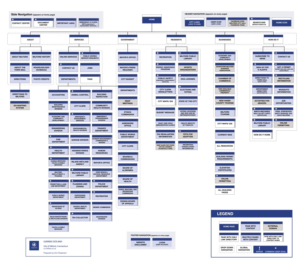
The first thing I did to create my city’s current site map was to just go through every page, click every link, and see where it took me and the type of content that was there. I kept a hierarchical list of all the pages I found and a note for what type of content each of them had. This was a painful and slow process, to say the least.
The pages numbered in the hundreds, not including links to pdfs or external domains. There was absolutely no way to denote every single page on my map. Many pages were part of the fourth tier or below navigation on the site under pages for departments or boards containing these respective areas’ content. I indicated these pages existed under other pages with a specialized multipage symbol in my map legend.
Inventorying the content, I realized many of these pages were unnecessary. There was a page for each member of every board and commission that just listed their contact information. This content could be easily consolidated into the main page for each board or commission, especially considering the content for each of those pages only consisted of a list of members.
I also found that navigation, especially on the second tier and below, was cluttered with random links. Some board and commissions were pulled out into the navigation menus while others only existed on the “Boards and Commissions” page within the overall directory of links.
I don’t work in the Milford government nor do I have any insider knowledge, but I suspect this was done either because of internal politics or as a band-aid to specific complaints that certain users could not find certain information. I’ve seen this happen before. The easiest way to stop someone complaining about a website’s navigation is to just fix their specific issue, instead of the root cause of it within the overall IA. However, sometimes this can lead to random change after random change that causes disorganization or clutter in the navigation of a site and leads to problems for other users.
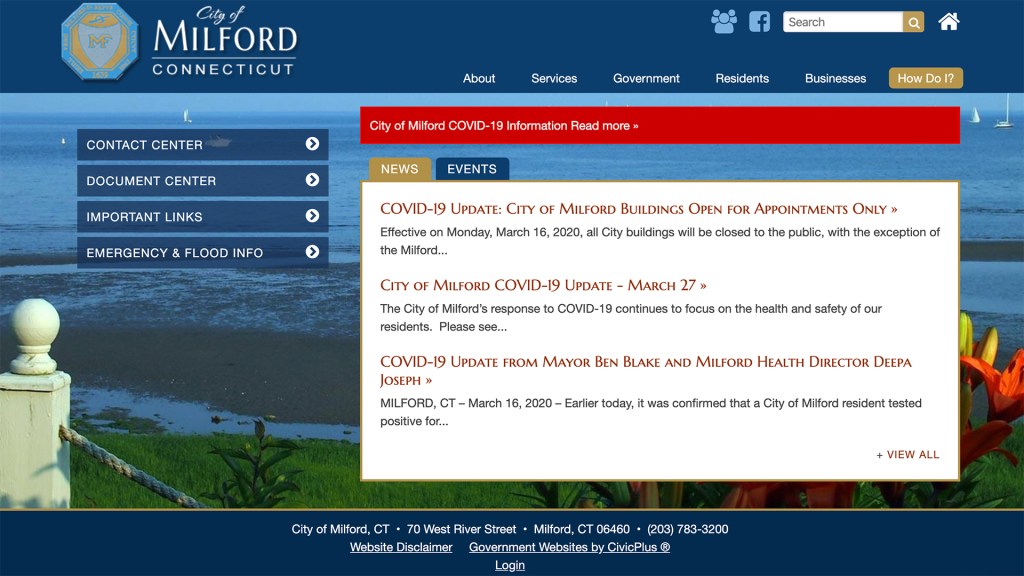
I’m a resident of Milford and the most common reason I interact with my city government is to pay my property taxes. When I went to the “Resident” category in the global navigation, some items in the local navigation there made sense because they were also common resident interests—“Recreation”, “Milford Public Library, “Public Safety”—but a link to pay taxes or to the tax collector’s office was nonexistent.
Instead, the “City Clerk’s Newsletter” page was on the menu. There may be some residents who care about that, but I can’t imagine it’s as many as care about how to pay their taxes every year. Placing such a niche item in the local navigation of a main category on the site doesn’t prioritize the common goals of users.
Continuing my search to find how to look up and pay my taxes, I next went to the “Services” category in the global navigation because I thought my goal to pay online might be considered a service the city would provide. Alas, nothing about taxes listed there either. On a return visit to this category an item on the local navigation of “Services” called “Online Services” finally revealed a page that included links to everything from paying taxes to the library catalog. I somewhat understand the desire to offer a one-stop shopping place for everything you can do online through the city, but it wasn’t my instinct to look there. I was looking for something labeled with the word “tax” or “taxes”.
After “Services”, I went to the “How Do I?” global navigation category, but I only found an option for information on how to have my taxes reevaluated. The clearest most logical route I found to my goal ended up being through the “Government” category in the global navigation to the “Department” directory page then to the “Tax Collector” page where everything from looking up to appealing to paying taxes was available in the fourth tier local navigation there.
Most visitors to a local government website are going to be residents of that municipality, followed by local businesspeople. Usually, when you are interacting with your local government it’s for 1 of 2 common reasons, either because you are being forced by the government to do something—like pay taxes or get a permit—or you are looking for specific information to answer a question—such as what day your trash is picked up or where your polling place is. No one hangs around a government website for fun. Plus, government websites, by their nature of serving the general public, have users with a wide range of technological familiarity. Good IA that makes these types of websites quick and easy to navigate is a priority.

With this focus of having IA on the Milford website that prioritized the most common user goals, which I marked with an asterisk on my current site map, I created a second site map, above, for a proposed IA redesign.
The biggest structural change I made was to eliminate the side navigation on the home page. It consisted of only 2 links that might be a priority for a large group of users, one to a contact form and the other to a document directory page. I moved these pages to the footer because this way they would be visible on every page as a user navigated the site instead of being hidden on the home page, which many users may not enter the site through or ever visit.
Instead of having each global navigation category link to a page that only consisted of a link directory, I had each category in the redesigned display present a dropdown menu when selected to show what was categorized under that section. This way users can get straight to what they care about most.
Dropdown menus like this exist on the current site but not every item on a category’s link directory page was on it’s dropdown menu and the ones that were, did not always seem of the highest priority. This meant some important information could never be found if users assumed everything was on the menu and never clicked on the section page.
The 3-click rule says that optimally users should be able to get to any content on a site within 3 clicks. Offering only a dropdown menu option instead of sending users to another page to see all the navigation items locally in a section eliminates a step for users. Even in content-heavy sections such as the “City Clerk”, users can now access most information in 3 clicks from the global navigation.
I reordered and labeled the global navigation categories as well. Since users in the U.S. generally read from left to right and most government site visitors are local residents, I placed the “Residents” section first on the menu, followed by “Businesses”, which is probably the second largest group of users. In a mobile view, these menu items now appear at the top allowing for quicker assess. The items in the dropdown menus for these 2 sections now also focus exclusively on the common goals for each of these user groups. Since these 2 sections are now dedicated to helping users find government services to fulfill common goals, I eliminated the “Services” category from the global navigation.
It’s common to place the “About” section of a site first in global navigation, but how often do residents or local businesses care about this type of information? We already live and work in this city. We don’t need to know the basics about it and that’s rarely, if ever, a reason to visit a government site. This would be more of a goal for an outsider, a much smaller user group. Instead, I moved the “About” category last and included the information about government leadership, meetings, and more logistical content under it.
I replaced the “Government” category with “Departments” and a dropdown menu featuring links to each overall department page, some of which have multiple subdivisions. This allows for a secondary direct route for users to find specific information via the already existent categorization of departments within the government, if the information they seek is more niche or it is not instinctual for them to look under “Residents” or “Businesses”.
Finally, I replaced the “How Do I?” section with a FAQs button next to the search bar in the header. FAQs is a much more common website label users know to look for when they have a question or problem and now it is available right next to another feature users look for when they need help.
Reflections on IA and Content Management

My proposed site map for Milford simplifies the IA for the site. I changed some labels, eliminated some unnecessary pages, and reordered the global navigation, all the while thinking about what was most important or would make the most sense for users. For practical financial reasons, my proposed IA does not necessarily require a UI redesign. The bones of Milford’s website are not bad. The site is responsive, which for a local government website is still impressive today. The color palette isn’t atrocious, and the font doesn’t feel super dated. It’s not the most up-to-date design, but it’s serviceable considering its government category. Honestly, the biggest challenge with the site seems to be content management.
There’s a lot of outdated content linked in local navigation 2 or 3 tiers down that clutters everything up. Also, many pages have so little content they really don’t need to exist, they are just making users do more work in the form of clicks. A little investment in the visual hierarchy of main landing pages could help consolidate a lot of these pages into a central location. This, of course, takes time and often web content management for governments, nonprofits, or small businesses can be a low priority in terms of resource allocation.
For the Milford website, though, I can’t help but see how linked IA design and content management investment are. It might be easy for a content manager to add an item in the local navigation of a page to find a quick spot for a piece of information to live, but they should really consider first what is best for users the same way information architects do.
As librarians receive new books, they must find homes for them. They do not simply throw them on any old shelf and call it a day. They categorize the new books and adjust the whole shelving system a little in order to make room for the additions in a place that they can be found easily. They do not break the organization system, they work within it.
The same should be true of a website’s IA. Websites are constantly living, growing information containers like libraries. It’s important to establish and maintain a well-designed structure for navigating and accessing them and reevaluate that structure regularly or the information offered within it will go to waste.
References
Arhipova, A. Information architecture. basics for designers. Tubik Blog. Retrieved from https://blog.tubikstudio.com/information-architecture-basics-for-designers/
Amherd, B. (2016, June 30). The difference between information architecture (IA), sitemap, and navigation. Medium. Retrieved from https://medium.com/@amherd/the-difference-between-information-architecture-ia-sitemap-and-navigation-64eba19296c
Babich, N. (2020, January 12). An introductory guide to information architecture. Adobe XD Ideas. Retrieved from https://xd.adobe.com/ideas/process/information-architecture/introductory-guide-to-information-architecture/
Brown, D. Eight principles of information architecture. Bulletin of the American Society for Information Science and Technology, vol. 36, no. 6, August/September 2010, pp. 30-34.
Cardello, J. (2014, June 22). The difference between information architecture (IA) and navigation. Nielsen Norman Group. Retrieved from https://www.nngroup.com/articles/ia-vs-navigation/
UX Booth Editorial Team. (2015, December 22). Complete beginner’s guide to information architecture. UX Booth. Retrieved from https://www.uxbooth.com/articles/complete-beginners-guide-to-information-architecture/
Pikover, J. The comprehensive guide to information architecture. Toptal. Retrieved from https://www.toptal.com/designers/ia/guide-to-information-architecture