
Usability is the measure of how well a person can use a product to achieve an intended goal. In a previous post, I talked about how usability testing should be a key part of an iterative design process, preferably being implemented as early as possible to identify design problems. But usability testing is also an important tool to evaluate existing products before you ever sit down at the drawing board to devise a new design.
If a product has been around for a while and you’ve become familiar with it, you might think you could easily identify its design problems. But the more you know a product the likelier it is you’ve become blind to or biased against seeing certain issues (Krug, 2006). Plus, if you’re a user your experience, however valid, is still anecdotal when it’s the only one referenced. You need to research others’ experiences to start identifying patterns to verify if a problem you see is niche or widespread. In the end, a product design needs to work for the way actual users use it, not how the designers, researchers, or other product insiders believe they should use it.
Planning Usability Tests
The good thing about conducting usability testing on an existing product is, well, that it exists. You don’t need to invest time and energy in building a prototype before you can test. You just need to create a testing script, decide on a list of tasks you’d like your test subjects to attempt with your product, and recruit participants.
For your tasks, you want to present them to participants in the form of relatable scenarios to help with context and understanding. You also want to make sure you choose tasks that are important for your product, such as ones related to its key functions, or ones related to specific design areas you’re planning on working on.
For participants, you want to try and choose ones who are representative of your product’s actual users. However, if that’s not easily possible it’s still important to conduct testing with the people available to you as long as they have the right skills to use your product – for example, knowing how to use the internet.
The same is true for the number of participants. You can run as many tests as you want but studies show that you start to get diminishing returns beyond 5 participants in a single round of testing. It’s better to save participants and effort beyond this to conduct another round of usability testing after making a design change.
It’s also nice to run a pilot test before doing the actual testing sessions to work out any kinks with your script or tasks (Baxter, Courage, & Caine, 2015). For the usability testing sessions discussed below, I wasn’t able to conduct a pilot test and one participant struggled a lot with understanding one of my tasks to the point of being unable to complete it. If I had identified this problem earlier, I may have been able to reword or restructure the task instructions to make them more user-friendly and avoid any issues.
Conducting A Usability Testing Session
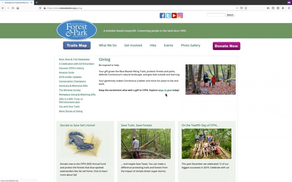
Above is an excerpt from one of the 30-minute testing sessions I did for a site (ctwoodlands.org) I’ve been conducting user research on. Having recordings like this are extremely helpful for reviewing when doing data analysis. Just be sure you explain to participants how the recording will be used and get their permission before recording anything.
None of my test participants had ever used the site before. Because of time and resource limitations, I was only able to recruit 3 participants from amongst acquittances of a site user and they were all representative of the same user segment. Some testing, though, is always better than none.
The tests were conducted remotely using Zoom. While remote testing like this has the advantage of helping overcome obstacles like lack of testing facilities, geography, or gathering restrictions caused by a pandemic, if you’re testing a physical product or your users don’t have compatible devices or high-speed internet connections in-person testing may be better.
At the beginning of any research session, it’s important to make the participant feel comfortable so that you collect accurate and helpful data. After sharing the test instructions with participants, I started my sessions with warm-up type questions such as “What do you do for work?” and “What kinds of websites do you use the most?” These were low stakes and relatively easy for my participants to answer, helping to build their confidence about doing the test, while they also provided me with some further insight into my participants.
From there I sent them the link to the website via the Zoom meeting chat and after opening it and sharing their screens with me I gave each a few minutes to give their first impressions of the site. I then jumped into the 5 tasks I had for them to do:
- You’re looking to learn more about conservation and wildlife. Find how you can register to attend a Connecticut Forest & Park Association event within the next month.
- You recently went to a CFPA event and are now interested in becoming a member of the organization. Find how you can sign up for a membership online.
- You want to try out a new trail this weekend that was recommended to you but you aren’t sure where you can park to access it. Locate a parking lot on the Salmon River Trail.
- Your employer has a donation matching program in which they double donations made by their employees to charitable causes. Learn how you can have your employer match your CFPA donation.
- You’d like to help support CFPA in their work of maintaining over 800 miles of trails. Find how you can volunteer to do trail maintenance.
Each of these tasks was read aloud then provided to the participants to read themselves via the chat. This second communication option turned out to be important for 2 of my participants who struggled to process the tasks auditorily and who wanted to reference the task instructions as needed as they were going to be sure they were remembering correctly.
You’re not testing the participants’ learning style so it’s important to provide both a verbal and written option to communicate instructions to them. This way they don’t feel like they’re failing to do things correctly or asking for special treatment if they’d like to read the tasks rather than hear them. Feeling as if they’re wrong can make them self-conscious and not behave naturally. In-person you can simply provide participants with a piece of paper with the task on it. When testing remotely, figure out what the digital equivalent would be for your set up as I did by utilizing Zoom’s chat feature.
Other than these comprehension problems and, as mentioned previously, how this actually interfered with a participant’s ability to complete a task (Task 4), there were no other major logistical hurdles in my testing session. Participants completed tasks at a rate of 93% with an overall mean completion time of 2 minutes and 9 seconds, which was better than I anticipated.
From just 3 tests I was able to identify 17 problems of the specific user journeys of these tasks and observe 5 general problems with the overall site design. Based on the behavior patterns I observed across all 3 tests I devised the following site-wide recommendations:
- Refresh the visual design with a more up-to-date style
- Develop an in-page style of button to be used consistently for calls-to-action within pages, eliminating the use of hyperlinked text for this purpose
- Redesign the top menu to make it more central to overall site navigation, focusing specifically on helping with the primary functions of the site: memberships, fundraising, facilitating outdoor activities, volunteering, and other involvement with CFPA
- Make section landing pages more useful by providing information on key goals of that section instead of functioning as pass-through pages for just introductory marketing copy
- Redesign tertiary navigation menus to have fewer categories and more clear, concise labeling
Some of these – like the out-of-date style – I had guessed before the tests were probably going to need addressing in the redesign. The comments made by the participants about the outdated style, especially of the site’s button, just backed up my thinking. Others – like the use of hyperlinked text for in-page calls to action or the large, cluttered tertiary level navigation – I’d overlooked as being problems until I saw how users went about completing the tasks. I saw them often avoiding the tertiary level navigation, even though it had exactly what they needed, and struggling to notice calls to action when they were included only in the text of pages.
From this, I started to see there was a pattern of the site underutilizing buttons in page content, which sometimes impeded navigation and slowed users down. Even though the site’s pages don’t have a lot of content on them nothing really stands out which makes it hard to quickly scan and locate key information as internet readers usually do.
Without buttons, participants were sometimes required to review the whole text of a page to find even the most important calls to action. The only thing that drew participants’ eyes when scanning was the green color of hyperlinks. Tertiary level menus had green hyperlinked text but users still tended to pay the most attention to the content in the center columns of pages. Designing these menus to be more than just columns of copious, random hyperlinked text but instead to be wayfinding with clear and concise categories and labels could be helpful to users. It could also be helpful to employ a better content strategy to make landing pages more valuable. Better content could help them support the wayfinding of key information if users overlook tertiary menus.
It’s Easier Than You Think
As you can see, I was able to generate an initial list of design recommendations by investing only 10-15 hours into developing, executing, and analyzing 3 usability testing sessions. This simple approach can work for getting a larger redesign process started – potentially even to prove a redesign is necessary – or for making regular, incremental improvements to an existing product. But no matter what stage of a project or a product’s lifecycle you are in your design work can always benefit from usability testing.
References
Baxter, K., Courage, C., & Caine, K. (2015). Understanding your users: A practical guide to user research methods, tools, and techniques. Elsevier: Waltham, MA.
Krug, S. (2006) Don’t make me think: A common sense approach to web usability. New Riders: Berkeley, CA.