Back in the earlier days of the internet businesses and organizations jumped on the then-novel idea of having a web presence. However, those websites were usually built to be nothing more than digital brochures, houses for information with maybe an e-commerce integration if you were fancy. As the digital age of the 2000s and 2010s arrived these websites evolved into interactive hubs where users could go for far more than brochureware.
Websites are now powerful marketing, sales, public relations, entertainment, support, advocacy, and community spaces. And as COVID-19 has shown, they are also now the front doors to organizations. Along with social media, they are often the first or only means of interaction people have with a business so, their experiences better be good.
For some, though, making this transition has been harder than others. Longstanding businesses have, in some cases, been resistant or slow to pivot operations and decision making to place digital interaction as primary. Small businesses and nonprofits have struggled, even when they know investing in their website is important, because of funding shortages, the inability to plan long term, and simply lacking the knowledge about how to approach a successful redesign project.
There’s good news and bad news on this front. The bad news is we’re at the point where hedging your bets with a not so good website experience can severely limit your success. The pandemic ushered that moment in sooner, but it was always coming. The good news is it’s never been easier to learn what it takes to build a good experience for your site’s users.
Take a look at a site research project I recently completed to see one approach for doing this.
Learn About the Site
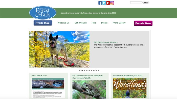
This research project was focused on ctwoodlands.org, the external-facing site for the member-based conservation nonprofit Connecticut Forest & Park Association (CFPA). The organization was founded in 1895 with a mission of connecting people to the land in Connecticut. It has maintained this site since the ’90s, updating its design 3 times in the past 20 years. The current iteration of the site was introduced in 2015.
The project started by gathering initial information on the requirements for a new design. The organization needed the new site design to support business and marketing operations such as fundraising and land advocacy while users required that the site support them in doing outdoor activities and getting involved with CFPA.
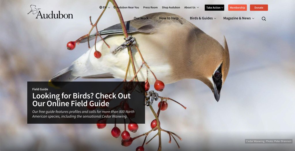
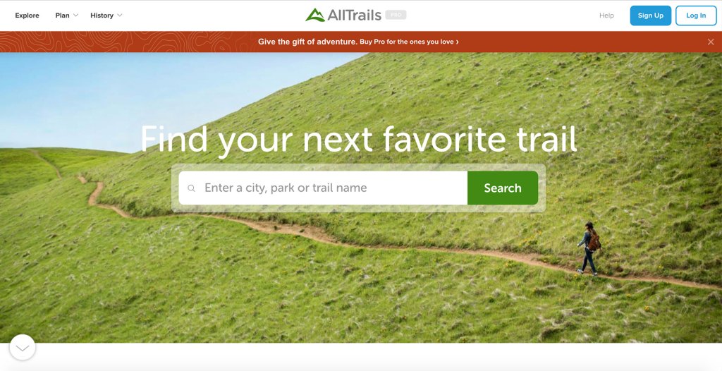
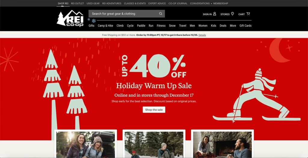
After establishing the initial requirements for the site, a competitive analysis was conducted. The content, design, and functionality of CFPA’s site was compared to sites for 3 other brands related to conservation and outdoor activities – REI, AllTrails, and the National Audubon Society. These brands were selected in part to see how the organization’s site ranked when compared against wider-reaching, more high-profile sites that CFPA’s users are also likely to interact with and build expectations based upon. The hope was that this analysis would serve as inspiration for design ideas to help CFPA differentiate themselves in a beneficial way from their direct competitors.
Learn About Users
You can’t design a good user experience based on your understanding of a site alone or only from the internal perspective of a business. You must understand the people who are actually using the site.
I developed an interview study and survey study to gain insight into the current users of the CFPA site. Within these, users were asked about how and why they use the current site, what is important to them on the site, problems they’ve experienced, and their opinions on previously identified opportunities for additional functionality, such as a member message board.
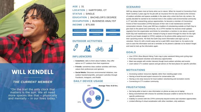
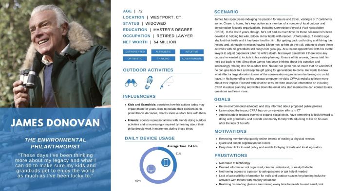
The quantitative and qualitative data attained from interviews and surveys are usually used to create personas – profiles of fictional individuals who each represent groups of users. These are then used throughout a project and beyond to help designers put themselves in the shoes of users when making decisions. The 3 personas above were created for CFPA representing current members, prospective members, and donors. Each persona has information on the wants, needs, obstacles, and characteristics of this type of user, as well as an accompanying scenario describing how they would go about achieving a specific goal on the site.
Because the organization has a mission of connecting people to the land and already offers an interactive trails map on its current site, I developed a diary study examining site users’ current behaviors in relation to outdoor activities and technology usage. The study asks participants to respond to a provided set of questions each time they do an outdoor activity over the course of 8 weeks. The questions were designed to understand the role technology plays in outdoor activities for these users and if there is opportunity for the CFPA site to be more of a resource in these activities than it is currently.
Usability testing was conducted to understand how and why the current site design does or does not meet user expectations and needs. During this type of testing, participants are observed using a website to complete tasks provided by a moderator. Participants think aloud as they attempt tasks so researchers can understand the thought process behind their behavior. You can see an example of this in the video above featuring one of my usability sessions for CFPA.
Potential CFPA test participants were screened to make sure they shared the characteristics of current site users but were not previously familiar with the site. Excluding actual current users helped prevent familiarity with the site from hiding potential problems. 3 usability testing sessions were conducted remotely via Zoom in which participants were asked to complete 5 tasks.
To additionally assess the usability of the current site, a heuristic evaluation was done by a third-party researcher. In this evaluation, the site was examined to see how well it obeyed 10 basic principles of usability, such as preventing errors and offering a consistent design.
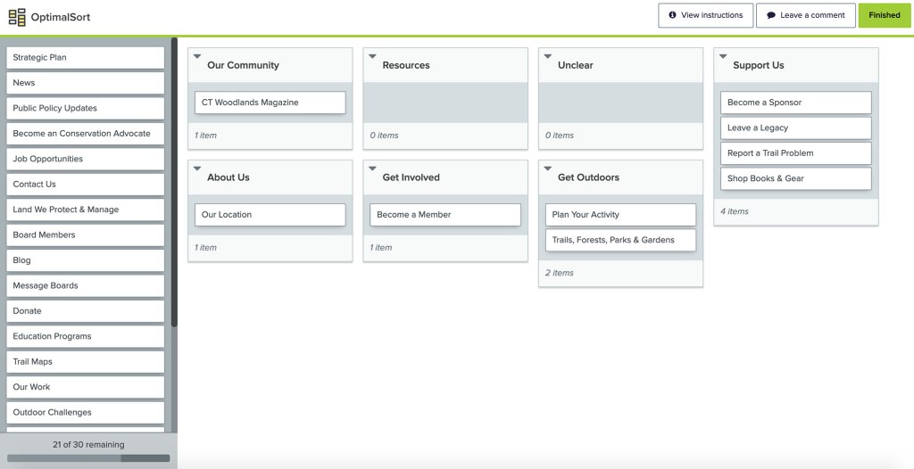
Both the usability testing and the heuristic evaluation identified the top menu labeling and organization to be problematic. In response, a new set of categories for the menu were developed and the idea of consolidating many subcategories from the footer menu into the top menu was proposed. To test these 2 ideas a card sorting study was conducted.
Card sorting is a research technique that provides insight into how the information architecture (IA) of a website should be designed in order to help users navigate and discover information easily. During card sorting, participants are asked to organize a group of cards representing parts of a website or items related to it into categories. Their responses then provide insight into user thinking which helps guide (IA) design. The CFPA card sort evaluated potential new categories for the top menu, how to condense the contents of the current footer and top menu together, and where proposed expansions of content and functionality needed to be placed.
Analyze the Data
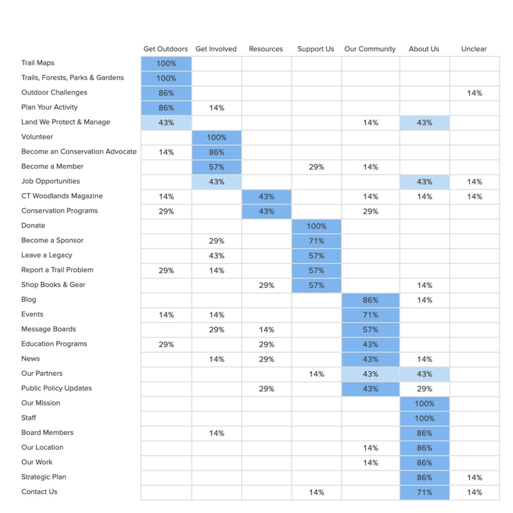
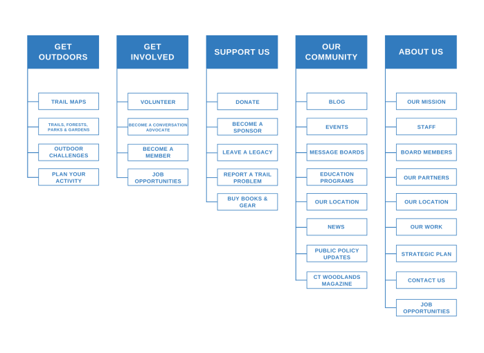
Data collected from these research studies showed that the CFPA site had good bones to start with but was suffering from disorganization and dated design. It had decent information architecture and the site search, in particular, worked well for navigation, but the site needed some menu reorganization and label changes. Card sorting helped develop a new architecture for the top menu based around 5 categories – “Get Outdoors,” “Get Involved,” “Support Us,” “Our Community,” and “About Us”.
The site’s content was concise and relevant, but its visual design was dated and not fully responsive on smaller devices. Compared to other sites it significantly underutilized photography and other media and visually focused too heavily on text. In usability testing participants struggled to scan pages, locate key information, notice all calls to action, and notice tertiary level navigation.
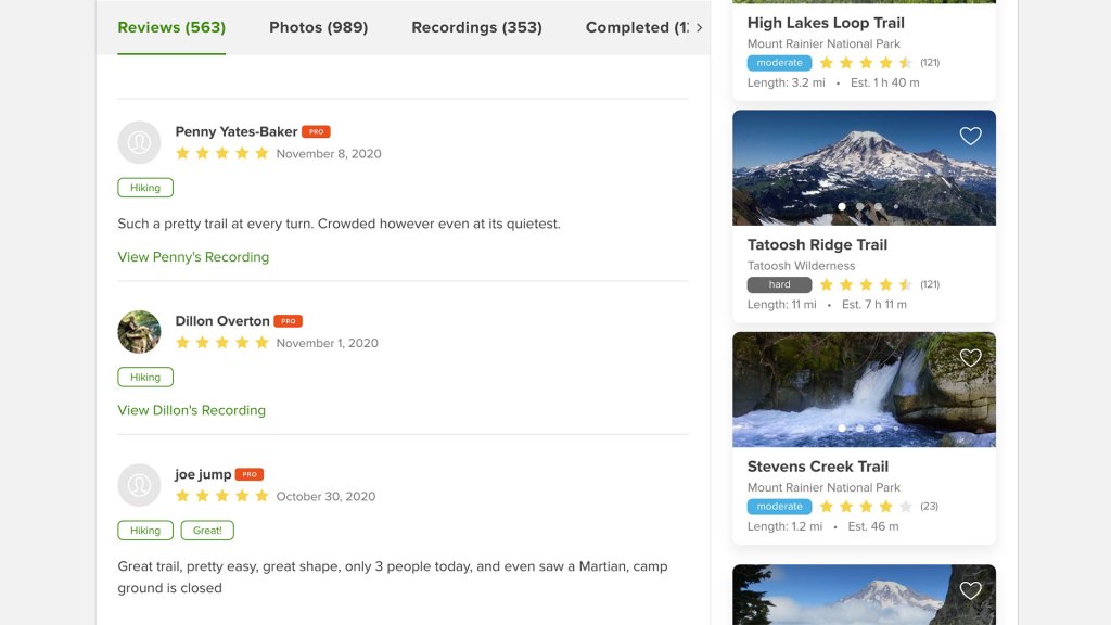
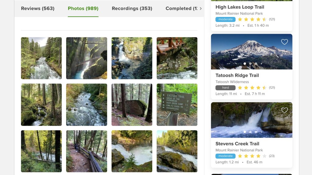
The competitive analysis identified that other outdoor brands and organizations are now using websites as community-building places, either through content or interactive functionality. An example can be seen above of reviews and photos submitted by users on a trail profile page on AllTrails’ website. Including more user-generated content and interactive features like a forum or message boards on the CFPA site could digitally activate the community feeling of the organization for users to see.
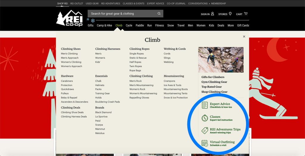
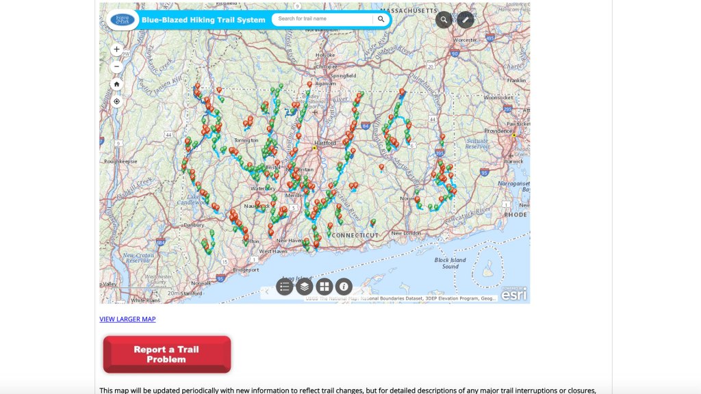
The competitive analysis also revealed how other sites interweave different types of content to better support users in getting outdoors. For example, REI provides expert advice blogs about certain activities alongside links to purchase related items within menus on its site. In the usability testing, participants were excited at the offering and features of the trails map and the heuristic evaluation recommended that additional features similar to Google Maps be added to it to further support users. How this idea of providing more resources for outdoor activities could be realized on the site was explored in the diary study and inspired the new “Get Outdoors” section that tested well in card sorting.
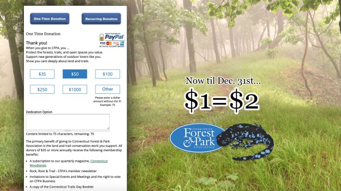
One of the biggest revelations was that the current site design was not centered around memberships, either recruiting and signing up new members or involving them in the organization. The heuristic evaluation noted there were many call-to-action buttons, but none of them were for membership sign up. Participants in the usability study also found it odd that the membership sign-up form was just the general donation form, indicating they saw being a member as different from being a donor. Considering this data, and that the organization describes itself as a “member-based nonprofit” in the site header, this was a big miss in terms of supporting both organization and user goals on the site.
Develop Recommendations
The CFPA site turned out to be a site that still focused too heavily on just being a repository for information. Beyond updates on events or volunteer opportunities, there was little reason for those associated with CFPA to often visit the site and little appeal to entice new users to the site.
From my research, I developed the overall recommendation that the site function additionally as both a resource for learning about and planning outdoor activities and as a place for the organization’s community to connect. Not only do these new areas of focus align with the mission of the organization, they also provide a value-add to site users and for those involved with CFPA.
I was also able to build a rather extensive list of over 20 initial recommendations from which a new site design could be developed, including:
- Refresh the visual design with a more up-to-date and responsive style
- Focus design on more photos, video, and media and less text
- Optimize content and design for smaller devices and slower internet speeds, such as is often found on trails and areas CFPA’s map supports
- Create pages, forms, and call-to-action buttons specifically for memberships
- Redesign the top menu to make it more central to overall site navigation, focusing specifically on helping with the primary functions of the site: memberships, fundraising, facilitating outdoor activities, volunteering and other involvement with CFPA. Menu categories should consist of “Get Outdoors,” “Get Involved,” “Support Us,” “Our Community,” and “About Us”.
- Redesign tertiary navigation menus to have fewer categories and more clear, concise labeling
- Develop an in-page style of button to be used consistently for calls-to-action within pages, eliminating the use of hyperlinked text for this purpose
- Incorporate user-generated content and bring in social media content on key pages
- Offer message boards as a place for members and volunteers to connect and talk
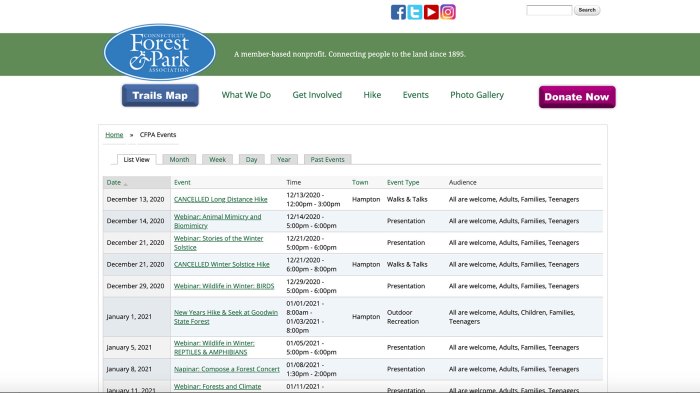
- Add a search feature to the events calendar, incorporate more advanced filtering to search events by type, and enable attachment of custom tags to event pages to improve filtering
- Integrate all events, including volunteer events with specific dates, into one central calendar
- Have the combination of info sections on event pages and fields on registration forms be customizable according to the parameters of an individual event
- Include links to similar events or others in a series on event pages to increase discoverability
- Integrate videos, photos, and tips about trails within the trails map similar to how Google Maps provides user photos and street views to allow users to see a location and better prepare before going there
- Include trail difficulty level and accessibility information on trails map
- Provide the link to a specific trail on the map whenever it’s mentioned anywhere in site content to create a loop of discoverability
- Include the ability to send a trail map to someone else via a link, email, or social media just as Google directions are easily shareable
- Integrate the map search with site search to make trail maps more discoverable
Where to go from here

It took about 2 months to develop, conduct, and analyze the findings from my research in order to form these recommendations. This is a very quick and dirty way to gather data about a site and its users, but some research is always better than none when approaching design work.
Implementing all of these recommendations in the initial phase of a project for a small, nonprofit like this probably isn’t possible, but the user insights gained from this research can help to identify what is most critical. With this type of guidance, designers can begin working with an organization to lay out a project plan and timeline for the new design. Maybe some things will need to wait for a few years, but at least the business can know what they need, why they need it, and start working to raise money or make a roadmap for how they’ll get where they need to be with their site.
Building a better website is about so much more than making it pretty or cool. It’s about making sure it meets the needs of those using it. Whether you have a multi-million dollar project or a shoestring budget doing this type of work first and placing the user at the center of your new design will produce a better site that will work for your business, rather than against it.

