
Psychologist Mihaly Csikszentmihalyi defines the concept of flow as a highly focused mental state in which you are immersed completely in the task at hand. If you’ve ever been “in the zone” or “in the groove” then you’ve experienced flow. As Csikszentmihalyi explains in the video below, not only is flow highly productive, he also sees it as a means for attaining happiness.
If you’re a user experience (UX) designer, eliciting positive emotions, like happiness, from users is what you are aiming for with your designs. You want to strive to create an experience that is conducive to users achieving a state of flow while fulfilling whatever goals they may have. Flow happens when your level of skill and the level of difficulty of a challenge are equal. In other words, you must meet users where they are with your design.
For websites and apps, there are many aspects of an experience that can work to make users happy and pleased, such as content or visual design, but there is one aspect, if done badly, that can overrule them all: navigation.
In previous posts, I discussed information architecture (IA) design in relation to websites and app. IA design is focused on providing an organized structure for users to navigate within and find what they are looking for. IA is the skeleton around which technology, content, and contributions from other design areas will be placed. Good IA is crucial for good UX design. To know, though, if an IA design is optimal for users, you must understand how they travel through the site or app.
Flowcharts and User Flows
Flowcharts are a common tool introduced in the 1920s by industrial engineers Frank and Lillian Gilbreth that are now used for a variety of purposes in a variety of industries, including engineering, business, and education. As the video above explains, these charts depict a process by using a visual language of symbols and arrows to represent the multiple steps and paths within it. Flowcharts can help those who use them to define a process, standardize a process, communicate a process, identify bottlenecks, waste or other problems in a process, solve a problem, or improve a process.
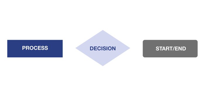
UX designers create a type of flowchart called a user flow to depict and communicate the process of user movement. User flows utilize the same symbols as flowcharts in order to represent every route users can take to achieve a specific goal on a site or app. The most common flowchart symbols found in user flows are pictured below: a rectangle for processes, a diamond for decisions, and an oval for the beginning and end of the flow.
UX designers also use a flowchart called a wireflow which is a user flow that includes images, or wireframes, featuring the screen layout of a site or app that users see at each step in a process instead of symbols. These can be very helpful for understanding the context of other elements besides flow that impact user experience. Plus, it’s fairly easy to replace flowchart symbols with small mobile or app view screens on a chart. For this post, though, I am focusing on basic user flows.
User flows help you to gauge the efficiency of a website and make sure you’re not wasting users’ time. Visually seeing the process users go through to achieve a goal can show you why users may be having difficulty and how you can design a more intuitive experience for them. Like other UX design deliverables, user flows also help you to easily communicate and justify design decisions both inside and outside your team so that everyone involved in a project is on the same page.
Tips for building an easy to understand user flow, or a flowchart in general, include:
- Flow symbols left-to-right or top-to-bottom as this is the natural way our eyes move
- Keep the chart to one page, unless a process is complex enough to justify multiple pages
- Keep the sizing and spacing uniform on the chart
- Include a key to explain the meaning of all symbols used
- Use no more than 3 colors, even if utilizing color coding to highlight paths or symbol information and meaning
- Use only one font and make sure it is easily legible
- Include as few words as possible to increase readability
Once you understand these guidelines for constructing flowcharts, you can make helpful user flows by following these steps:
- Define the purpose and scope of your user flow. What are you trying to depict with this chart? Why are you interested in this? What are you hoping to gain from it? Who are you planning to communicate with using it?
- Identify the steps in your user flow in chronological order. What is every step a user must take to achieve the defined goal? Do research. Talk to other team members. Talk to users. Put yourself in the users’ shoes and engage in the process yourself. Find where improvements are needed.
- Assign each task to a corresponding symbol category. Is something a process a user must do? Is it a decision they must make?
- Construct your flow, either by hand in a sketch or using a flowchart or similar type of design program. When creating a user flow using software, a good approach to follow would be to get all your symbols on the page first, then rearrange then into the best layout you can come up with before connecting them with arrows. Otherwise ensuring sizing and spacing is uniform and that everything fits on one page can be challenging.
- Check and challenge your flow. When finished go through the whole process yourself from beginning to end. Is anything missing? Could part of it be more efficient? Ask other people to look at it and give feedback. Find areas of improvement, don’t just document the process you designed.
Creating and learning from User Flows

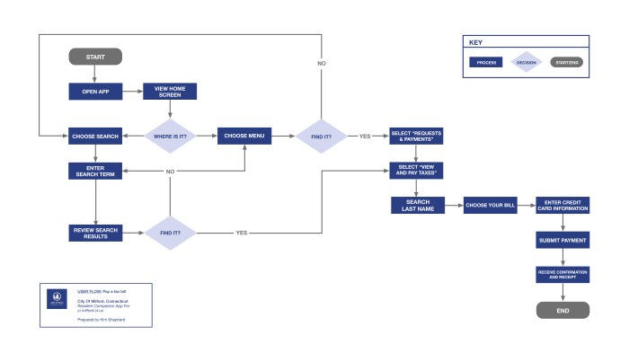
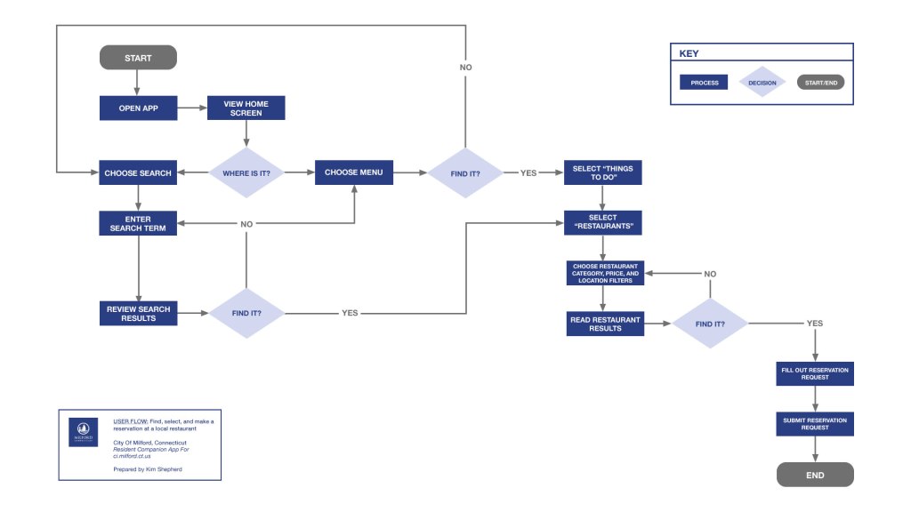
In a previous post, I explained how I designed the information architecture of a resident companion app for my city’s municipal website, which is aimed at being an on-the-go resource for residents. Using the app’s site map, the visual depiction of its IA design, I’ve created 3 user flows.
In order to make my user flows, I first created 3 very basic user personas to represent different types of users the app would have. In the UX design process, personas are defined early based on user insights gathered in the research phase. User flows are generally created early as well after research is completed and design planning has begun.
Personas help you to empathize with your users. Creating a user flow using a persona helps you to more easily put yourself in the shoes of users and understand how they would move through your site or app for their needs. Once I had my 3 personas; named “Lena”, “George”, and “Teresa; I thought about one need each of them might be likely to have on my app based on their characteristics.
“Lena” represents all the relatively new residents to Milford so, I thought having her learn to do a common resident task such as paying taxes on the app would be fitting.
“George” takes on the role of older and lifetime Milford residents. It seemed logical that someone like him might be more protective in making sure the city is taken care of and willing to invest the time in order to make that happen. His need on the app then became submitting a service request to Public Works.

How long “Teresa” had resided in Milford mattered less to me than the fact that she stood for all the residents who were also part of the local business community. Her connection to business told me she was best suited for need related to that area so, I had her want to find a local restaurant using the app.
For each persona’s need, I wrote a user story to succinctly communicate it. User stories are short, descriptive statements of what a user needs told from their perspective. For example, “Lena’s” user story was:
“As a new, busy resident of Milford, I need to pay my taxes online so that I can avoid standing in line at the Tax Collector’s office during limited business hours.”
I expanded on my user stories by creating user scenarios. These take the characteristics of the persona and their need and create a longer, more detailed story explaining the context of their situation and their motivation for using something, in my case the app.

With my personas and their user stories and scenarios in mind, I looked at my site map and traveled through it for every route I could imagine my user might take, documenting each step I took and decisions I had to make.This process takes patience. I found that defining where decisions happen was the most likely part of a process that I would leave out at first glance.
We make decisions, such as I’m going to use the menu versus the search function to find something, so fast and instinctually that we don’t consciously register those as decision-making moments. My advice when defining any user flow would be to ask yourself if there was anywhere else in the process that you have not documented where multiple options exist for the user. If there is then there should probably be a decision symbol at that point in the user flow. It might be a lightning-fast decision, but it still impacts the experience a user has.
I approached defining the chronological steps of each of my user flows as if I was giving someone wholly unfamiliar with a city driving directions. In this case, you’d never leave off a turn just because they only need to travel on a road for a block. The same is true in your user flow.
It can be tempting to consolidate or leave out very small steps because in comparison they seem too insignificant to warrant an entire symbol on the chart. Try, though, to break out each step as clearly as you can in order better understand and communicate the route users travel.
Not everyone who uses this chart may be as familiar with your website or app. You may be able to intuit something exists between 2 steps, but most others need to see it represented on the page. Plus, this helps remove assumptions about a process and potentially reveal areas for improvement.
You don’t necessarily have to create user flows for every possible need a user may have on your site or app. As you can see, all 3 of my user flows are pretty similar. They diverge mostly towards the end when users are near completing their tasks.
This is the nature of the IA design of my app in that it’s fairly simplified in terms of routes users can take to initially discover something from the home screen. They can either search for it or open the menu and select a category. I also attempted to create routes that circled back to the beginning or straight to another option so as to not leave users at a dead-end if a certain route did not work for them initially.
From just these 3 user flows, I’ve learned a good portion of the process for doing dozens of other tasks on my app. Especially if you have limited time or resources, I’d suggest prioritizing the creation of users flow for the user needs you believe you could learn the most about and improve the most or those that you’ve defined are the most vital for the success of your site or app or most important to users.
Reflections

Overall, creating user flows for my app helped me to evaluate whether the IA and site map I designed actually offered users the efficient experience that I was aiming for. My app is meant for my city’s residents to use on their mobile devices in all types of settings and situations to do tasks that they may not often want to dedicate much time to. I want the routes they must take on the app to complete their tasks to be as straightforward and simple as possible.
If any of the user flows for the 3 relatively simple needs I chose to focus on in this post had turned out overly complex, unable to fit on one page, or confusing to the point where even I had difficulty documenting or following them, then that would have been a warning sign for me. In this case, I would have had to return to my site map to reevaluate my IA design and make changes.
My user flows now, though, are ready to be examined for incremental improvements. Through reevaluation myself or through user testing there may opportunity to consolidate steps needed in these processes or add routes more intuitive for users than what I’ve already designed.
An important thing to keep in mind about UX deliverables like site maps and user flows is that they are living documents. They can and should be reexamined and changed if needed both during the design and build process, but also throughout the life of a site or app because the world changes.
User needs and priorities shift, content additions are made, and technology advances. The IA and flows you plan for users in the beginning don’t have to be set in stone. They can rise to meet changes and discoveries as they happen and in doing so help to consistently offer a good, efficient user experience.
References
6 Useful Flowchart Tips to Create Better Flowcharts. Creately. Retrieved from https://creately.com/diagram-type/article/6-useful-tips-drawing-flowcharts
Brown, C. (2019, October 14). What are user flows in user experience (UX) design? Career Foundry. Retrieved from https://careerfoundry.com/en/blog/ux-design/what-are-user-flows/
Mind Tools Content Team. Flow Charts: Identify and Communicate Your Optimal Process. Mind Tools. Retrieved from https://www.mindtools.com/pages/article/newTMC_97.htm
Mock, L. (2018, January 11). The comprehensive guide process flow diagrams & process flowcharts. Gliffy. Retrieved from https://www.gliffy.com/blog/the-comprehensive-guide-to-flowcharts
Nielsen, J. (2011, April 25). Workflow expectations: presenting steps at the right time. Nielsen Norman Group. Retrieved from https://www.nngroup.com/articles/workflow-expectations/
Nishadha. (2019, April 30). Ultimate flowchart tutorial (complete flowchart guide with examples). Creately. Retrieved from https://creately.com/blog/diagrams/flowchart-guide-flowchart-tutorial/
What is a flowchart? Lucidchart. Retrieved from https://www.lucidchart.com/pages/what-is-a-flowchart-tutorial?fbclid=IwAR3L1TXWM1htLzjDVTKYw0iS641eLA36JfDmdN7da4PTa72VSYmAVzp0KVs#discovery__top