Sometimes when designing technology, you have to forgo technology and get back to basics with good ole pen and paper. With so much tech around us every day it’s pretty easy to just jump straight to software to start designing when the most helpful tools are actually the ones already sitting in our desk drawers. If you’re designing a website, app, or other tech product one of the best tools to use to start deciding what it will look like and how users will interact with it is a paper prototype.
What is Paper Prototyping and Why Use It?
Paper prototyping is sketching how you initially envision your user interface (UI) to look. These types of sketches are generally done early in a design process, after such steps as user research and information architecture, and are low fidelity, meaning they require minimal effort, experience, and skill to produce.
This low bar for entry is one of the biggest benefits of paper prototyping. You don’t have to know software like Sketch or Adobe XD to create paper prototypes which means more people can be involved in the visual conceptualization of your product. The more perspectives in the prototyping conversation the more ideas you will get and problems you will discover, increasing your chances of figuring out the best design.
Paper prototypes are also faster to produce and easier to modify than digital prototypes, as the video above shows. This makes paper a cheaper option for the beginning stages of prototyping when you may be uncertain of your approach and end up going down a lot of dead-end routes before honing in on the best options. There’s no bias to continue with bad design options because you’ve invested a ton of time or resources in the prototype. Just crumple up the paper, toss it in the recycling bin, and grab a fresh sheet.
Paper prototyping is best for exploring the high-level design of your product, such as the layout, information architecture, and user flows. For these low fidelity sketches, you generally do not need to include specific color choices, finalized copy, or other content pieces like photography. You’re not trying to impress anyone with your artistic skills. You’re just trying to offer an approximation of what users will see.
The goal with paper prototypes is to understand your product and develop direction for it quickly. Paper prototypes are generally used to get ideas in your head out on paper or, within a team, to communicate, discuss, and refine ideas.
You can also use paper prototypes for user testing. As the video above from Nielsen Norman Group explains, one of the benefits of testing with paper is you can make adjustments to the prototypes immediately during and between testing sessions should users run into problems.
Sometimes, though, user testing with paper prototypes can be challenging as these prototypes require users to employ a good deal of imagination and may cause some users to struggle. High fidelity sketches can be useful for solving this problem, but many designers go ahead and invest in making digital prototypes for user testing.
Nielsen Norman Group, however, argues, that starting user testing with paper prototypes is not only inexpensive to do but can allow you to get usability data earlier than normal in the design process. Digital prototypes take more time to develop and that’s lost time during which you could have been collecting data. It’s been shown that the earlier you gather usability data the bigger the improvements you can make in the user experience (UX) of your product over the course of your project.
How to Prototype With Paper

The first rule of paper prototyping is that there are no rules, but you will want to gather a few supplies before starting. I recently created a number of paper prototypes for an app I’m designing that will be a companion app to my city’s municipal website geared specifically towards residents. I started my process with an ultra-fine point black Sharpie, colored pencils, Post-it notes, and regular 8.5 x 11 printer paper. You may also find Sharpies in various colors or thicknesses, tape, index cards, glue, and scissors helpful during prototyping.
You can start sketching paper prototypes however you like, but I took the following approach as recommended by Dan Goodwin and Ben Coleman in their book Designing UX: Prototyping. They approach paper prototyping by working from the outside in on increasingly smaller elements of the design as they go. The order to follow is:
1. Devices
You must decide what device you are focusing your paper prototyping on. I knew I was designing an app, but I had to choose if I wanted to focus on the tablet, phone, or watch interface for that app. Each interface requires a different size, so deciding this before sketching is important. I chose to focus my sketches on the phone interface, specifically for iOS since at the time of my sketches I had more experience with and access to iPhones for inspiration and guidance than I had Androids.
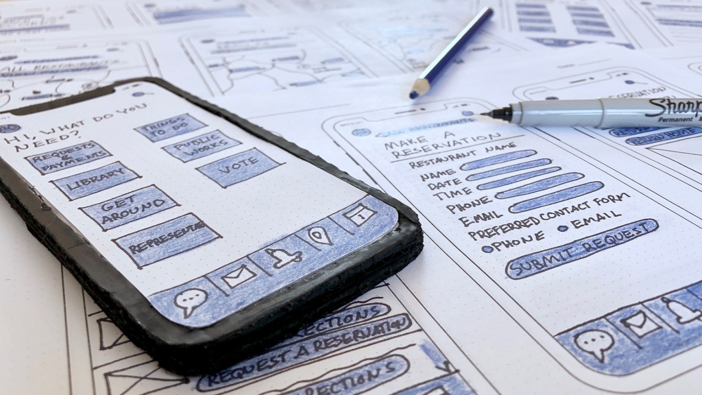
I wanted to sketch at 100% scale, so I found an iPhone X template for free online and printed copies of it out to sketch my prototypes on. There are pre-built templates for every device you could imagine available for free online, just do a simple Google search. I found using my template particularly helpful because mine offered a dot grid that helped me draw straight lines and maintain consistent spacing and sizing between my different screens without the cumbersome need to use a ruler.
2. Screens
When you approach paper prototyping you’ll want to have some idea of the screens you plan to sketch and their order. Since I had already created 3 user flows for my app, I decided to start by sketching these. It was pretty easy to use the flows to determine what steps were in a process and the screens I would need to make to represent all those steps
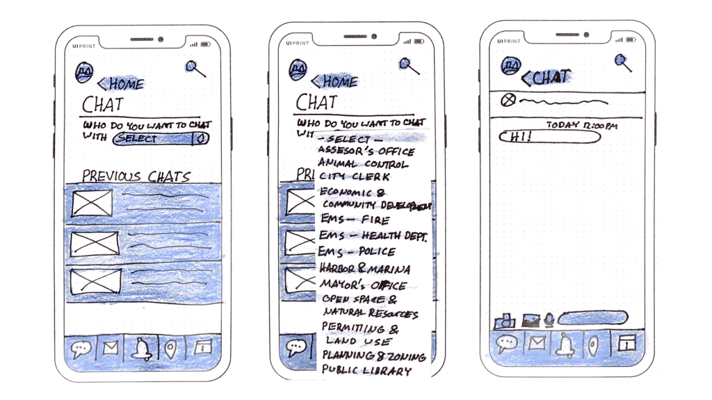
I also did screens for a couple of processes that I had not created users flows for yet, such as the chat function featured above. These sketches worked out fine, but they did take longer to create. I had to mentally put in the effort to define the initial idea for the flow at the same time as I was deciding on the design layout and elements.
This is the main reason you usually do paper prototyping after you do initial work on things like information architecture and user flows. Optimally you want to be playing with different ideas for user flows and how you could improve upon them, instead of just trying to wrap your head around the base concept of what a user is going to do in a certain area of your product.
3. Elements
Once you start sketching your screens you have to start deciding what goes on them, where, and why. To make these decisions you should consider how users will interact with each element and what they will need from it.
Since my app is meant to be used by all residents of a city, it will have a wide range of users with different abilities. Fancy, custom elements can be innovative and fun to design, but I decided to try and use native iOS features whenever possible so the app could more easily meet the expectations of my general public users. Familiarity was more important to me than being cool with my design.
I paid very close attention to the layout, navigation, and menu icons of pre-installed iOS apps like the App Store and Messages in order to try and mimic them with my sketching. My logic was that if a user is accessing my app via an iPhone they are likely to be somewhat familiar with the designs of this group of apps and therefore more comfortable in my app if it feels and looks similar.
I originally intended to put the main navigation of my app in a hamburger menu in one of the corners, but then I asked myself what the purpose of the home screen was for users. The answer ended up being nothing.
Things like events and alerts normally found on a website homepage had their own sections linked by buttons in the footer menu on my app. If I hid the main navigation categories in a hamburger menu, that was just another click users would have to make after spending time looking around for the menu icon itself.
I decided to focus the purpose of my app’s home screen on helping users find the main navigation faster since that’s what most users are probably heading straight for when they open my app. Unlike social media or news apps, my app is not one I anticipate users opening and hanging around just to kill time. They will likely use it only when they have a specific goal in mind so best to help them get to the point as quickly as possible.
After I made this decision I had to decide how to visually represent my main navigation categories on the home screen. I went back and forth between considering app-like icons or long screen-wide buttons. I figured going from a screen of apps on your phone to another screen of similar shapes and organization might require users to spend slightly less time orienting themselves. I then made sure that my navigation design was consistent for users throughout my sketches so second-tier navigation was drawn the same as the main navigation.
I’m not sure if, in the end, choosing essentially squares on a grid over rectangles in a list for the navigation design will matter at all for the UX, but I decided to play with it in paper prototyping. Perhaps user testing could help decide if this is the best direction. Is this navigation placement and layout intuitive for users or should I just rely on the common hamburger menu with a dropdown list in the corner? Users might be best to offer me the answer to this question.
The other big layout question I struggled with was the placement of the search icon. This is an important feature for navigation that plays a big role in my user flows. I know users read top to bottom so I placed the search icon in the top right corner of the screen to be found quickly. However, the large size of iPhones now means it may take more effort to click on that area of the screen than the bottom half.
I wondered if I should have placed it in the bottom right corner in the footer menu so users’ thumbs could tap it without reaching. I compared a number of apps, including social media ones like Facebook, Twitter, and Instagram, that users may be familiar with and it seems there’s almost a 50/50 split in placement between top and bottom for search icons. I came away unsure which is the better choice for users if one even exists.
4. Interactivity and State Changes
Paper is not a computer. You can’t make it dynamically change when a user makes a certain decision, produce a pop-up window, or scroll. Everything must be built manually with another piece of paper. This is where you need to get a little imaginative and innovative with your supplies and be alright with multiple attempts to get something right.
Many of my user flows required users to interact with fields that they must complete with information. I decided some fields would be better as radio buttons, others as dropdown menus that users could scroll through and make a choice, and still others as just free fields for users to fill in. Once I drew these fields on my screens, I realized I needed to approximate on paper how these elements behave when users interact with them on an actual phone.
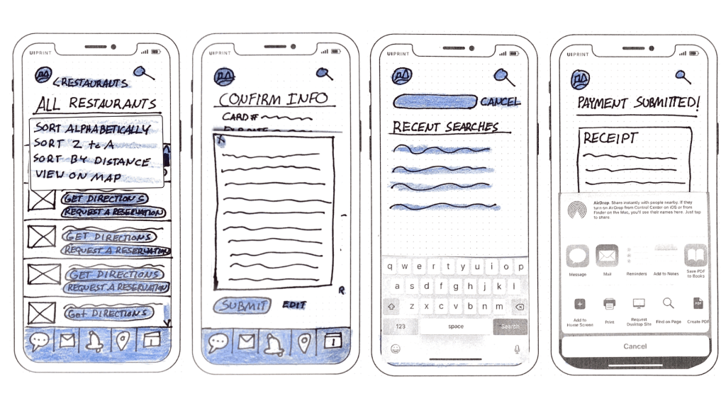
I created separate pieces of paper that could be laid over my screens for things like dropdown menus and popup windows, as shown in the left 2 sketches above. I also printed out screenshots of the iOS keyboard and share sheet, pictured above in the right 2 sketches, to represent the view when a user types or wants to share something from my app since these felt too complicated for me to draw well.
I also created small black dots to fill in the radio buttons and checkmarks for boxes but discarded them because they were too small to easily pick up and stick to my screens. If you are using your paper prototypes for testing, be sure that the way you are representing behaviors on paper does not slow down, frustrate or impede users. Otherwise, the results of your test may not be as accurate and useful as you wish.
Learning from Paper Prototypes
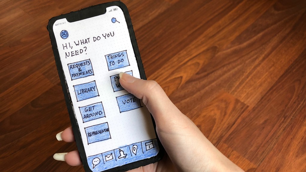
One of the last things I did when I was paper prototyping was to create a replica iPhone X out of cardboard, pictured above, which I could stick my screens to. (Small tip: cut off the sticky strips of Post-it notes and use double-sided tape to attach the strips to the backs of your screens. This makes it really easy to attach and detach the screens when interacting with them or using them for testing.)
Holding the screens up with one hand in my replica phone rather than looking down on them flat on a table made the experience of interacting with them feel more real and less theoretical. The only big difference between my replica and my real phone was the weight. Otherwise, my replica sat in my palm in the same place and hit my fingers at the same points. This is where I actually started wondering more about the placing of things in relation to a thumb’s reach and how important or not that might be for users.
I also learned from my paper prototyping experience that there were maybe more steps and decisions to my user flows than I originally anticipated. As I created some of my screens, I realized there were common elements users might expect in certain situations that I had overlooked.
If you make a payment, for example, a user generally expects to be able to get a receipt, either by saving or printing it out or by having a digital copy emailed to them. So I included these options on my screens. However, this means that after users pay their taxes and are presented a confirmation screen they may have a decision to make about their receipt before they consider their task finished, a decision that was previously missing from my user flow.
Discoveries like these are the major reason you create paper prototypes. This isn’t a moment to perfect and commit to design. This is a moment to get excited about seeing your imperfections and mistakes, to be freed, instead of frustrated, by the need to try again, and to be surprised when concrete direction suddenly becomes apparent from a rough sketch. So, go get a fresh Sharpie. It’s time to get to work.
References
CanvasFlip. (2018). The art of UX sketching and paper prototyping. Medium. Retrieved from https://uxplanet.org/the-art-of-ux-sketching-and-paper-prototyping-5dae5a1efc7d
Coleman, B. & Goodwin, D. (2017). How to Make Paper Prototypes. SitePoint. Retrieved from https://www.sitepoint.com/how-to-make-paper-prototypes
Dam, R. F. & Teo, Y. S. What Kind of Prototype Should You Create? Interaction Design Foundation. Retrieved from https://www.interaction-design.org/literature/article/what-kind-of-prototype-should-you-create
Fulton, G. (2017, February 16). Stop Talking and Start Sketching: A Guide to Paper Prototyping. Marvel. Retrieved from https://blog.marvelapp.com/stop-talking-start-sketching-guide-paper-prototyping
Nielsen, J. (2003, April 13). Paper Prototyping: Getting User Data Before You Code. Nielsen Norman Group. Retrieved from https://www.nngroup.com/articles/paper-prototyping/