
We’ve all been there. You’re in a hurry, you need some information or need to do something, and you think you know exactly how to accomplish your goal. Then everything goes wrong because you run into a bad website. It’s slow, it’s confusing, it’s sending you in circles! You’re forced to either trudge through to get what you need or abandon the site and try again somewhere else. Neither of these outcomes is what a user experience (UX) designer ever wants to see.
Field of Dreams may have introduced us to the concept of if you build it they will come (which is actually a misquote as the movie’s line is “If you build it, HE will come”), but online it’s more like if you build it you better build it well if you want them to stay. Users’ attention spans are short. They make judgments they may not even consciously realize about websites in seconds. Every element of a website’s design works in coordination to sway those judgments negatively or positively.
Now there’s an overwhelming list of elements to consider for web design, but to be helpful I’ve highlighted the following 8 design areas I think are important to offer a good user experience:
1. Information Architecture
Information architecture (IA) design is about creating a structure on a website that helps a user understand where they are and where they can find the information they are seeking. It’s concerned with navigation elements such as menus and the hierarchy of the content found within a site. For IA to offer an intuitive experience that meets users’ expectations you must consider details such as clarity of menu labels and hyperlinks, layout placement of priority content, and availability and functionality of search features.
2. Scannability
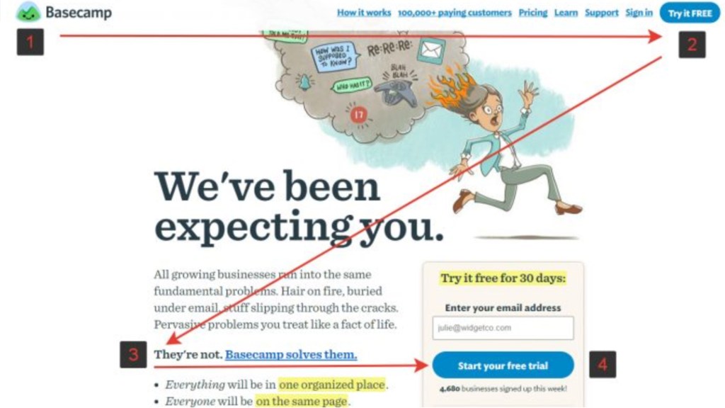
It’s not new information that online readers don’t really read. They scan information to quickly evaluate its relevance to them and then decide whether to commit time to read more in detail. If they can’t scan easily, users are likely to abandon a website. Generally, they will scan a page in a Z pattern or an F pattern so it’s important to consider this when designing. Other design elements that can improve scannability include headings, subheadings, numbered or bulleted lists, and strategically highlighted lines of text.
3. White Space (Negative Space)
Just as it’s true in print design, it’s true in web design: don’t clutter the page. Too much content too close together on a page makes it difficult for a user to focus and know what’s the most important thing their eyes should be looking at. This is a barrier that wastes time and frustrates.
Be sure to use a layout grid that helps you offer a cohesive, orderly design where each element is allocated the right amount of space in relation to everything else. And while it’s good to be mindful of page length, users are more conditioned to scrolling now because of the prevalence of mobile devices. Just make sure content at the top of the page is relevant and enticing and users will continue down the page to view the rest.
4. Content Strategy
Always remember the reason a user has for visiting a website and make sure the content is clear, easy to digest (no jargon), and relevant to their goals. Don’t overwhelm users with information. Feed them details in a step by step manner.
For example, if you have 10 products or articles that fall in a certain category just list 1 or 2 on a page where users browse category options as examples of that category. Then send them to a new page to view everything included in that specific category. Also, break up large chunks of text into smaller more scannable sections that help prevent information overload.
5. Imagery
Unfortunately, we do judge books by their covers. 90% of what we perceive is visual. Good web design includes imagery that is relevant to communicating the subject of the content and high quality to grab users’ attention. Be sure your photos are not pixelated or distorted in any way, are optimized for web, and sized to fit the dimension requirements of your site. Also, be sure to avoid stock photography that feels fake or inauthentic as this doesn’t help users connect with you and hurts user experience.
6. Responsive Design
In case you didn’t know, we live in a mobile world now. By 2025 its predicted 72% of internet users will only use a smartphone to access the internet. It’s easy to get caught up in focusing too heavily on desktop view during a design project, but some elements that work on desktop don’t work on mobile. Consider a mobile-first design approach even if it means sacrificing some great design elements on desktop. If mobile users must pinch to view content, can’t seamlessly access all your site’s functions, or have their phone battery drained trying to load your site, your site’s effectiveness will suffer.
7. Loading Speed
Jumping off the last point, load speed is important for all users – the video below shows how just increasing load time from 1 to 10 seconds can increase abandonment by 123% – but it’s especially important for mobile users. Not only are we all just less patient now and are most likely using mobile devices in situations and settings in which we have less time to waste, but many users are now exclusively dependent on mobile networks and devices for internet access. Either because of income or location, these users do not have access to affordable, high-speed home internet connections.
Load speed in a way is an accessibility and social justice issue that all websites should be concerned about, but you should be especially concerned with it if your site is meant to serve users affected most by the digital divide. Unfortunately, according to Nielsen Norman Group, the average load speed for a website has not really improved in a decade on desktop and has even increased on mobile in that time frame. We’ll see how the sites below compare to the average.
8. Accessibility
Accessibility as defined legally by the Americans with Disabilities Act requires that websites accommodate the needs of users with disabilities. This can mean using high contrast text for users with low vision, avoiding the use of color to convey meaning for users with color blindness, descriptive text and inclusion of image alt text to be compatible with screen readers for blind users, and keyboard accessibility for users who navigate with a keyboard instead of a mouse.
There are different levels of compliance for different types of websites that if not met can lead to legal and financial liability for discrimination. There’s software you can use to scan your website for compliance, but this doesn’t always catch everything and is designed only to see whether your site meets bare minimum requirements. Web design in this area should follow the spirit of the law more than just the letter if you’re interested in offering the best user experience for all.
Web Design Analysis
To show how you can evaluate these elements of web design I’m going to look at an example of a good site and bad site, although as you will see it’s a bit more complicated than that.
Until relatively recently my professional work was focused on the theatre industry. As part of my social media and web content responsibilities, I frequented sites that offer theatre reviews and industry news. I’ve pulled the following examples from that experience because they both elicit specific feelings from me as a user.
BroadwayWorld

My Feelings
I once did a guest blog series for the Nashville regional section of BroadwayWorld and although the site’s design has changed a couple of times since those 2013 pieces, being a user of the website still makes me feel like I’m visiting a chaotic rummage sale of content.
1. information Architecture

If there wasn’t a clearly placed search function at the top of this site, I would never be able to find anything. The top navigation just seems to be unhelpful. Looking for a review, for example, I’m never sure if I can find one under Shows in the global navigation or under Sections. The dropdown menu of categories under Sections reveals Reviews as an option, but the label Sections itself is problematic for me. When I stop and think I realize it’s referring to sections like in a newspaper, but as an online-only publication it’s just not an automatic association that that’s where every written piece of content they produce would be.
2. Scannability

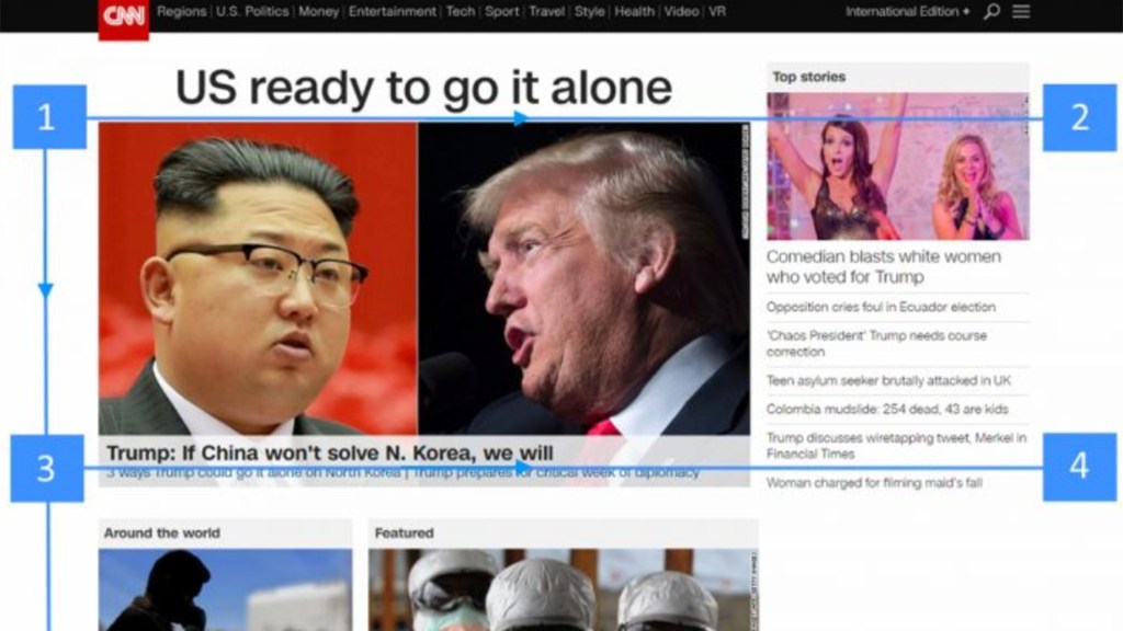
I can’t scan this site well at all, even when I purposely try a Z or F pattern. Halfway through I get confused about which pattern I’m supposed to follow. Some of the subdomains have content that’s far more scannable because it’s in clear lists, but the homepage is horrible. It has my eyes bouncing around unsure of what text to read because there’s so much and there’s not a clear differentiation between headers, subheaders, regular copy, and copy in or over images.
3. White Space (Negative Space)
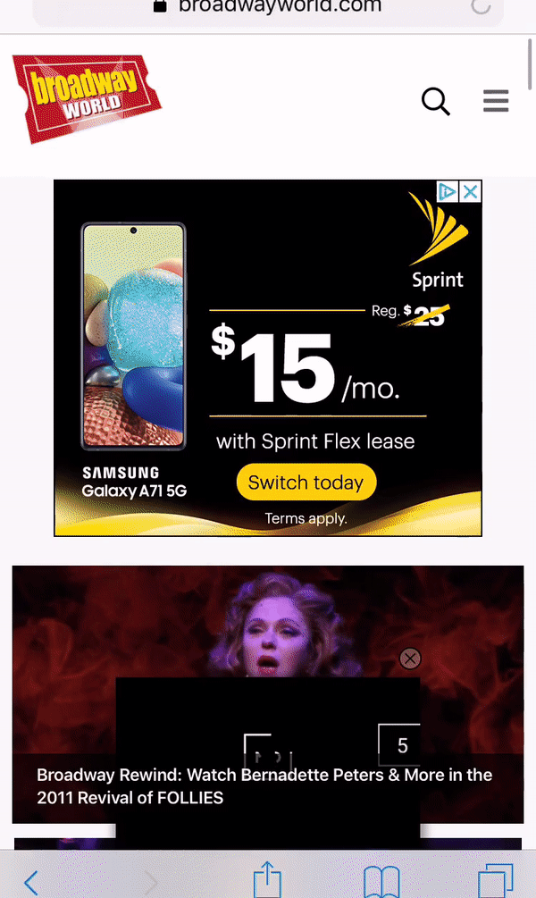
Especially on the homepage, there’s no empty space. There are so many boxes and columns full of stuff that it’s hard to tell what’s the site content and what’s advertising. In fact, ads fill up any chance for white space and some even follow you down the page as you scroll – as shown above – making it impossible to focus.
4. Content Strategy

The homepage seems to be focused on mostly promoting the site’s produced content rather than, for example, it’s chat boards or products for sale. However, it overwhelms me with content options from every category they have. Besides the top left featured video, I have no idea what they even think is important for me to see.
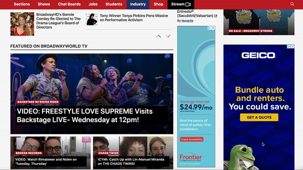
Subdomains feel a little more focused, but even then, they’re not laid out to prioritize their purposes. The Reviews section seen above, for example, has tiny thumbnail images for the actual review link that barely draw my attention while the less relevant Hot Stories links and BroadwayWorld TV links on the page have much more prominent images.
5. Imagery

The photos used on the website are not consistently the same style nor high-quality which makes the content overall feel lower quality. Also, photos feel overrun by text, either because they are allocated much less space than text, have text in them, or have text overlaid on them to the point where you can’t really see the subject of the photos, as seen above.
6. Responsive Design
The website is responsive and in some ways is a slightly better experience on phones and tablets than the desktop experience. Text overlays on photos obscure less of the subjects, photos feel more prominent, and because all the content is stacked neatly in a line on phones it’s much easier to scan and focus on one thing at a time. It’s even easier to tell what’s an ad and easier to ignore them.
7. Loading Speed

When I opened the site on my phone it was sufficiently fast. I noticed, though, that it took longer to load the ads – but I don’t really care about those. However, on desktop I could see that all the media beyond the first section lagged in loading like the ads and that this made the site feel sluggish to respond when I first started interacting with it.
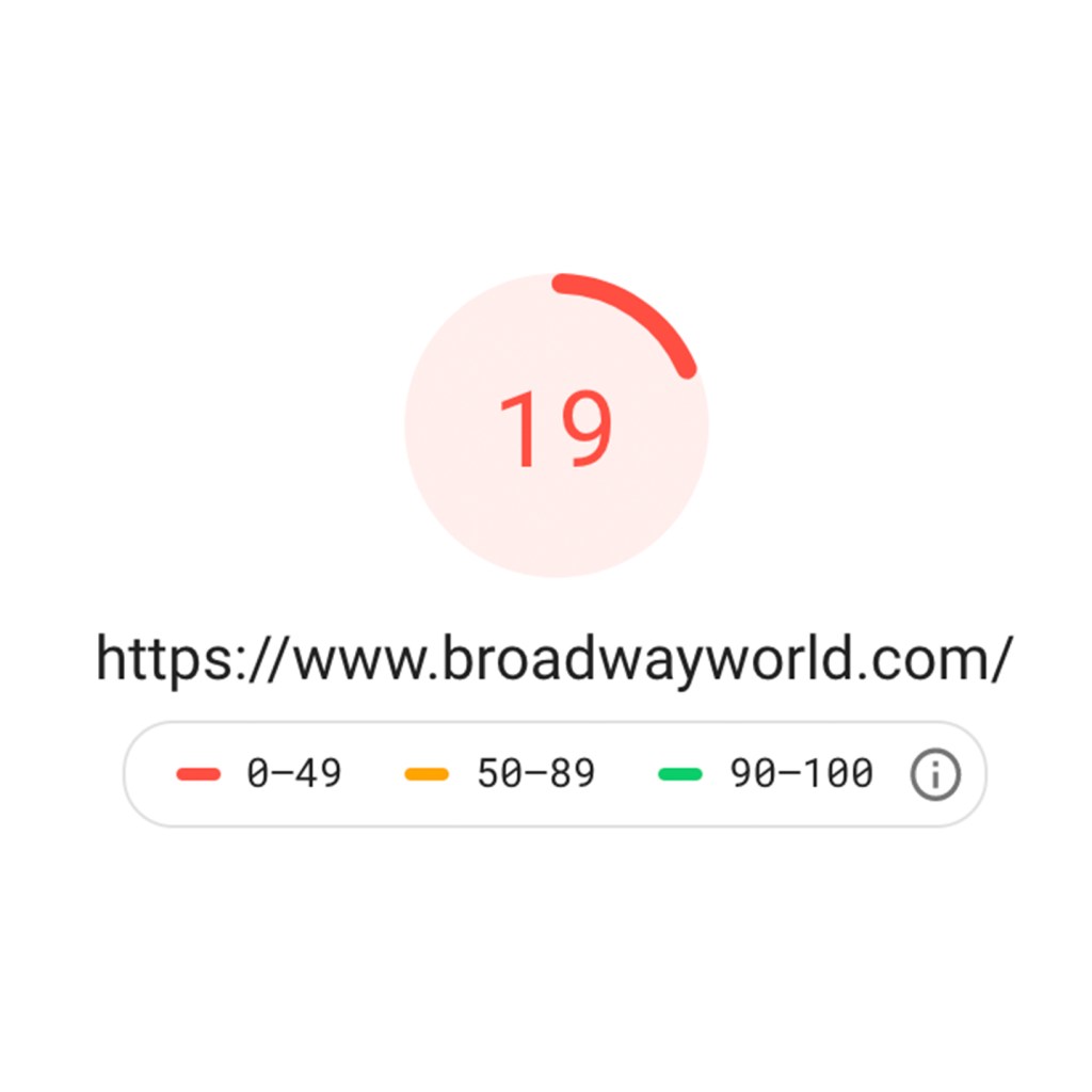
There’s a good chance that a large number of ads – including an automatic pop up video ad floating at the bottom of the screen – is slowing this site down. I sample tested the speed of the homepage with Google PageSpeed Insights and it ranked it 19 out of 100 on mobile and 41 out of 100 on desktop. Not so great coming from the search engine that says it plans to prioritize site speed in its search results.
8. Accessibility
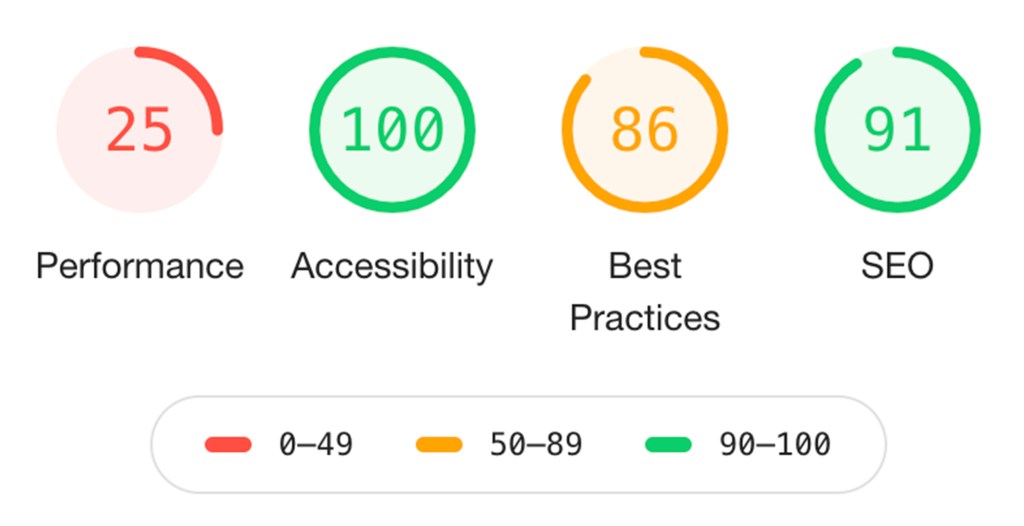
Without the ability to user test the website to see how well it worked for users with disabilities, I defaulted to scanning the website through Google Lighthouse; a free web development tool that scans any website for performance, speed, accessibility, SEO, and more; to get a baseline evaluation. Lighthouse ranked this site a 100 out of 100 for accessibility. Lighthouse evaluates a long list of criteria so this is a good sign, but I’d still like to know what actual users think before saying this site is fully accessible.
The new York Times Theater Section
My Feelings
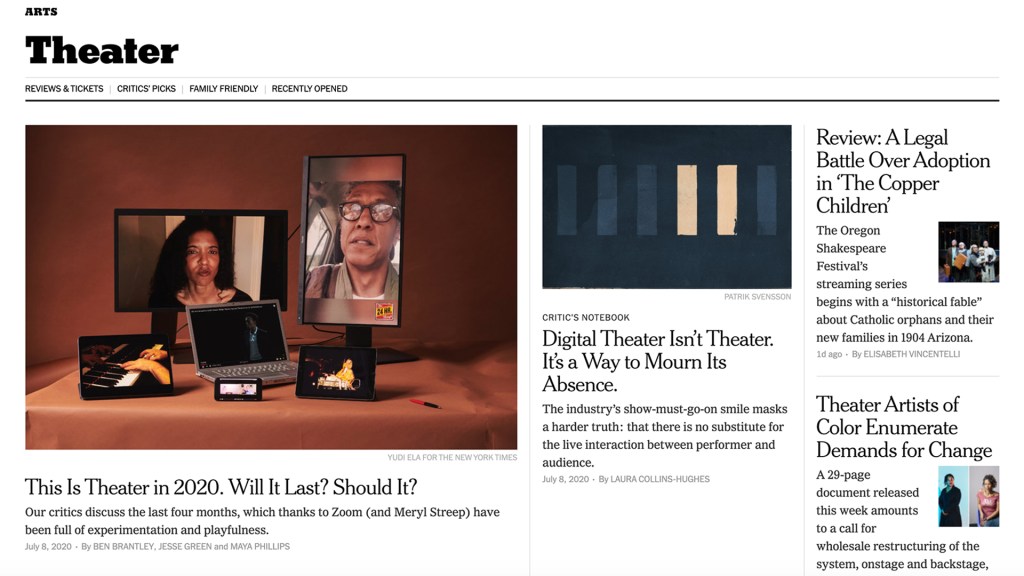
Even well-known media organizations have a reputation for having not so great websites if only because the amount of content they produce can overwhelm both users and technology. However, when I visit this section of The New York Times website I feel a sense of trust and relaxation as if I were entering a museum where the content is carefully curated and presented.
1. Information aRCHITECTURE
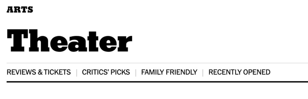
The labels in the top menu for this section of the website are clear in what type of content I will find under each. My only complaint is they don’t appear beyond the section’s homepage on article pages. The search options here are probably the standout feature. I have access to the search function that will give results for the whole New York Times website, but there’s also a dedicated search for just recently published theatre articles further down the page. Since this is the main reason most users visit this section it feels very supportive of their goals.
2. Scannability

It’s really easy to tell what a headline is and what body copy is on this site. Headlines are bold and if followed by supporting copy are at least twice as big. When supportive copy is present it’s kept to just one sentence on the homepage of this section. Content is also separated by dividing lines on the homepage in order to quickly know where one piece of content begins and the other ends. And it felt easy for me to quickly scan this page in a common F pattern. With a single column and inclusion of subheadings, the article pages in this section are also extremely easy to scan.
3. White Space (Negative Space)
There’s plenty of white space to keep me calm and focused on this site. Everything feels like it has enough room to breathe both on the homepage of this section and on the article pages like the above. There are a few ads but the spacing between them and the site’s content helps draw a clear line between the two to avoid confusion.
4. Content Strategy

There’s just enough content on the homepage of this section to entice me for more that will then be delivered in subsequent pages. It’s clear that the top part of the page is meant to promote the content the publication thinks is the most interesting and relevant right now while the second part of the page allows me to explore the rest of the content they’ve produced recently.
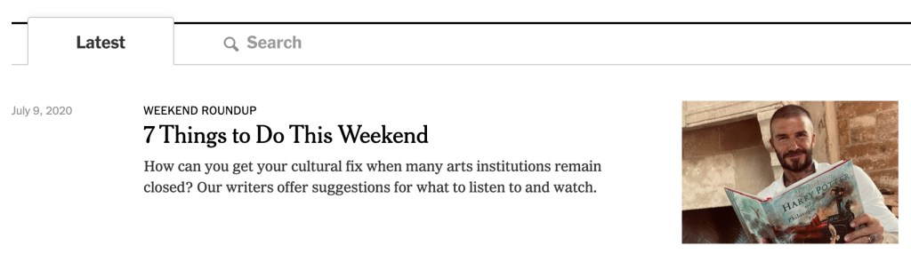
This second part offers me just 10 article previews. But there’s the option to always show more on the page by pressing a button, ensuring I’m in control and not overwhelmed with all the content at once. If I’m looking for something specific beyond featured or recent content then I have the 4 categories in the top navigation to help steer me to a page that’s focused more on what I want.
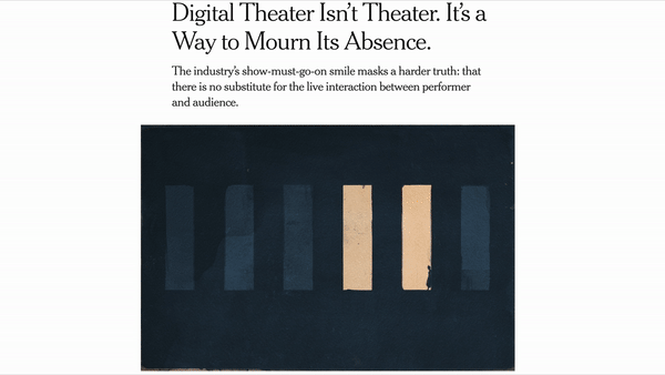
5. Imagery

Images used are all high quality and easily draw me into the different pieces of content. The space feels like it has a good balance between text and images and the images used help to communicate more information about the content, which compels my interest to want to more deeply engage with it.
6. Responsive Design
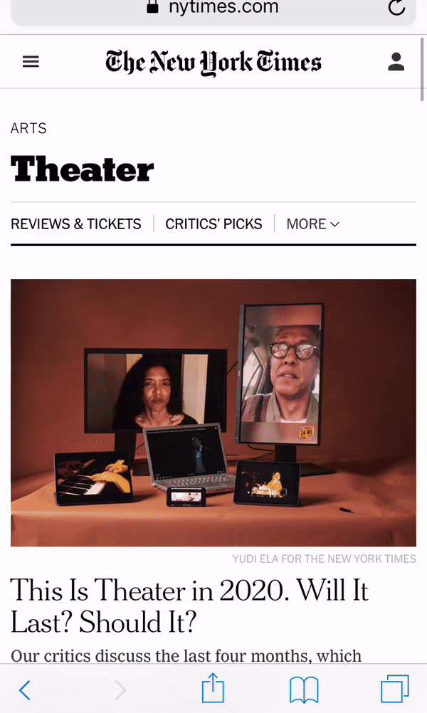
The website is very responsive, and the design translates well to tablets and phones without losing any of the functionality it features on desktop. Imagery has slightly more prominence on phones, but it still doesn’t distract from the text. On a phone and a tablet, it’s easy to scan and comprehend the content quickly as you scroll through the homepage and article pages.
7. loading Speed
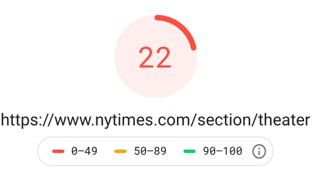
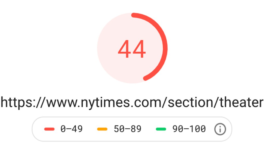
When I compared loading the site on desktop versus on my phone there was a clear lag on my phone of at least 3-5 seconds compared to desktop. Google PageSpeed Insights ranked the sections’ homepage 22 out of 100 on mobile and 44 out of 100 on desktop. Although this is slightly better than BroadwayWorld, it’s still not even close to optimal in Google’s eyes.
8. Accessibility
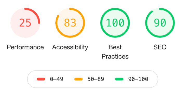
Surprisingly, Google Lighthouse ranked this website only 83 out of 100 for accessibility. Even though this site seems to outshine BroadwayWorld in terms of visual design elements, it still lacks some of the substance behind the scenes that’s needed to offer a good user experience for all
The Elusiveness of Perfection
No website is ever perfect or, as you’ve seen, even close to good at every single element of web design. Your website may be extraordinary in one way and fail in another. In fact, fixing one problem area can cause a new problem somewhere else. You must understand your site’s intended users and prioritize their needs as much as possible in your design. An important mindset to have for web design is to remember that you are always approaching perfection but can never really arrive there.
References
Babich, N. (2017, November 27). A comprehensive guide to web design. Adobe. Retrieved from https://theblog.adobe.com/a-comprehensive-guide-to-web-design/
Devaney, E. (2016, April 28). 8 guidelines for exceptional web design, usability, and user experience. HubSpot. Retrieved from https://blog.hubspot.com/blog/tabid/6307/bid/30557/6-guidelines-for-exceptional-website-design-and-usability.aspx
Handley, L. (2019, January 24). Nearly three quarters of the world will use just their smartphones to access the internet by 2025. CNBC. Retrieved from https://www.cnbc.com/2019/01/24/smartphones-72percent-of-people-will-use-only-mobile-for-internet-by-2025.html#:~:text=Marketing.Media.Money-,Nearly%20three%20quarters%20of%20the%20world%20will%20use%20just%20their,access%20the%20internet%20by%202025&text=WARC%20estimates%20that%20around%202,base%20of%203.9%20mobile%20users.
Li, A. (2020, May 28). Google will factor page speed, ‘Core Web Vitals’ when ranking search results. 9 to 5 Google. Retrieved from https://9to5google.com/2020/05/28/google-search-speed/
Rivenburgh, K. (2018, November 7). The ADA checklist: Website compliance guidelines for 2019 in plain english. Medium. Retrieved from https://medium.com/@krisrivenburgh/the-ada-checklist-website-compliance-guidelines-for-2019-in-plain-english-123c1d58fad9
Tubik Studio (2018, September 18). UX design practices: How to make web interface scannable. UX Planet. Retrieved from https://uxplanet.org/ux-design-practices-how-to-make-web-interface-scannable-2010125c710e
Whitenton, K. (2020, May 17). The need for speed, 23 years later. Nielsen Norman Group. Retrieved from https://www.nngroup.com/articles/the-need-for-speed/