
If a user can’t find what they need, can’t take the action they desire then a website is useless and the resources used to create it were wasted. This is a somewhat simplified view, but it can be easy when you approach a web design project to overlook the important role that organization, navigation, and search play in user experience (UX).
When businesses, organizations, or individuals start to hear complaints about their websites they often hook on to details like their site’s visual design not being as contemporary as competitors’ or its lack of the latest technical functionality. These are, of course, relevant considerations for any redesign, but they are not always the main source of problems for users.
“I can’t find X” and “I don’t understand how to X” are the user complaints I’ve heard the most often about the business websites I’ve done content management for. If you’re hearing anything like this in person, in surveys, on social media, or via customer care efforts then you should take a serious look at the bones of your site in your redesign.
Information Architecture and Sitemaps
Designing the bones of a website is the focus of an area of UX design known as information architecture (IA) design. IA design is about creating a structure on a website that helps a user understand where they are in the site and where they can find the information they are seeking. If users get lost in a site or feel as if their time is being wasted then their experience will be poor. Good IA design considers the purpose of a website, and the needs, goals, and expectations of its users to avoid this problem and offer a user experience so intuitive that users don’t even notice it.
Information architecture is visually represented using a sitemap. An important distinction to make here is that a sitemap can also refer to an XML document that provides search engines with a roadmap to your website. Visual sitemaps, though, use shapes, symbols, lines, and colors to depict IA elements on a site including pages, their hierarchy, relationships, goals, labels, content, and/or functionality. The meaning of each visual element is explained in a legend.
Sitemaps are valuable tools in web design because they:
- Prioritize and organize content, eliminating clutter
- Help avoid the duplication of content
- Improve search engine optimization through better page organization making it easier for search engines to crawl through and catalog all content (the better organization work on your visual sitemap, the better XML sitemap you’ll be able to offer search engines)
- Can be shared across teams and areas to establish baseline knowledge of the intended structure of a site and facilitate productive discussion regarding this area of the project
- Identify problems and opportunities early in the design process, helping to keep a project on schedule and on budget
- Are visual and help show the big picture of where all content lives and the routes that users take to find it, helping to build a better understanding of the site from a user perspective
- Establish the foundation for a good user experience
Sitemap Examples
I’ve previously used one of my favorite small businesses – Scratch Baking – to talk about social media strategy. In doing so, I’ve noticed that their website isn’t really designed the best, especially in terms of navigation and pages offered. The sitemap below is their current site and if you look at it you can tell it’s pretty simple – perhaps too simple – even for a small bake shop.
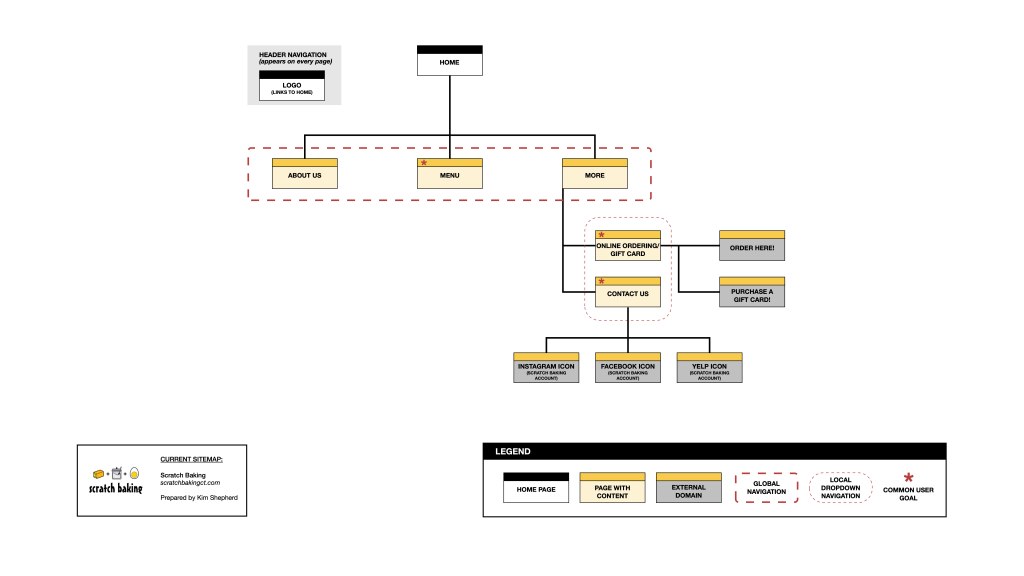
Their biggest source of revenue is daily, individual sales, but the link to order online is buried under the vague menu label “More.” Not exactly intuitive for users. They have one single page listing everything on their menu with no ability for users to go directly to the category they are most interested in. And I know they offer catering and special orders but there’s nowhere on the site dedicated to this content or even informing users that some information can be found on the menu page. This is a potential big miss in revenue because users can enter and leave the site assuming the business doesn’t offer these options.
Another small pet peeve of mine is that links to their social media accounts are not always available in either a header or footer. You can only find them on the homepage or under “Contact Us.” This is somewhat intuitive, but considering that they have good reviews and content on all their social channels, not having them always accessible to raise awareness is another miss.
Finally, the only recourse they offer for users who have questions is to contact the business. Offering a frequently asked questions (FAQ) page could save both users and the business time and effort.
Based on the problems I experienced as a user of Scratch’s website, I created the revised sitemap below.
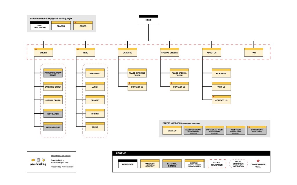
Build A Solid Foundation
As I mentioned, Scratch has a fairly simple business model and website, to begin with, so it was a quick process to come up with these preliminary proposed changes. The more content a site needs, the longer this part of the design process can and should take. However, it’s vital to do this work early and do it well because your sitemap will lay the foundation upon which your whole website will sit – and no one wants a crumbling foundation.
MORE IN THE WEB DESIGN ESSENTIALS SERIES


References
Arhipova, A. Information architecture. basics for designers. Tubik Blog. Retrieved from https://blog.tubikstudio.com/information-architecture-basics-for-designers/
Mrozek, K. K. (2018, January 4). Why create sitemaps and wireframes before the visual design? Windmill Strategy. Retrieved from https://www.windmillstrategy.com/insights/why-create-sitemaps-and-wireframes-before-the-visual-design/
Pikover, J. The comprehensive guide to information architecture. Toptal. Retrieved from https://www.toptal.com/designers/ia/guide-to-information-architecture
UX Booth Editorial Team. (2015, December 22). Complete beginner’s guide to information architecture. UX Booth. Retrieved from https://www.uxbooth.com/articles/complete-beginners-guide-to-information-architecture/