There comes a time in every project when an idea transitions from conceptual to actual. In website and app design that time generally comes during the prototyping process. Prototyping can be done in a range of fidelities, or levels of detail, from low to high. I’ve posted previously about low-fidelity prototypes and how they can be a great tool for quickly iterating design ideas and starting usability testing early in your design process. The type of experience they offer, however, is quite removed from a product’s endgame. High-fidelity prototyping is when things start to feel and look real.
High-fidelity prototypes offer a look at the planned design for the final product. A prototype can be high-fidelity in different ways. It can offer the same interactivity as the real-world product, the same content and commands, or the same visuals—or any combination of these elements. The key with any prototype, though, is to simulate the interaction a user will have with a product.
High-fidelity prototypes are used when a solid design direction has been chosen and needs to either be tested with real users or vetted with stakeholders for approvals. The closer to real a prototype feels to people, the less imagination they will have to use to understand it, and the more naturally they will act with it. This means feedback from testing will be more accurate and stakeholders will more likely be excited about what you are presenting them.
Types of High-Fidelity Prototypes
There are 2 directions you can choose from when building high-fidelity prototypes: a fully coded prototype or a digital prototype built using specialized software.
The first option obviously requires that you know how to code with some confidence. If you do, then this approach can offer the added benefit of getting a jump start on your product build. While there will inevitably be changes between prototyping and build, you will possibly have elements of your product built earlier with this prototyping approach.
This approach also forces you to address any technological limitations within your proposed design. Sometimes designers do not understand the capabilities and constraints of the technology that will power their design, leading to problems and redesign requirements during build. A designer who knows the tech can create a coded prototype and ensure a more seamless transition from prototype to build.
Coded prototypes can be time-consuming, though, and when taking this approach, it can be important to remind yourself that you should focus on creating just what you need in order to have people interact with your prototype. Although it’s great to want to go ahead and build the real thing now rather than wait, you are still at a point in the process where much can change so limiting time investment is important in order to avoid possibly wasting your time building detailed code that may be thrown out later.
A digital prototype, though, has the advantage of being quicker on average to build and a more accessible approach for most people. This is why it’s the more common type of prototype used. Software allows designers to simulate the user interface (UI) elements and the types of interactions users expect without technical knowledge. This approach creates a prototype that feels real on the outside but doesn’t have the technological guts on the inside that a real-world product would have.
Prototyping Tools
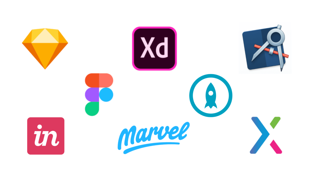
The biggest barrier to entry for building digital prototypes is access to and familiarity with the software. There are many prototyping tools you can choose from depending on your circumstances. Options include InVision, Marvel, MockPlus, Adobe XD, Figma, Axure, Sketch, Proto.io, Flinto, Justinmind, and Origami. Sketch, Adobe XD, and InVision are the most common tools you will find being used for prototyping. Although labeling and interface may differ slightly, the experience of using most of these tools is fairly similar and whichever one you choose is mostly based on personal preference.
A couple of things to consider when making a choice include the amount of money you are willing to invest for access to the software and the time you want to commit to learning it. Does one tool have special features you’ll use and are willing to pay for? Do you have experience with other tools that can make learning a specific one easier? Are you looking for a tool as a beginner or as a member of a seasoned team? All these questions can help you make the right decision.
My software of choice is Adobe XD. Practically speaking it’s very cost-effective for me since access to it is already included in my Creative Cloud subscription. You can, however, download it for free without a subscription. The only limitation it seems is the number of projects you can share with others at once. So, if this isn’t a problem for you, XD is the way to go to get industry-leading software at no cost. Major competitor Sketch only offers a 30-day free trial then requires a $99 lifetime purchase. Still a good deal, but possibly too high an entry point if you’re a beginner unsure if you’ll use the software enough yet to justify the price.
I also didn’t have much of a learning curve with XD since I have years of experience using other Adobe products. XD is very similar feeling to InDesign and Photoshop in its logic and UI so if you have experience with these programs it’s probably going to feel more natural and friendlier from the start.
The only big disappointment I have with XD is that it doesn’t provide a built-in option for placing device skins on your prototypes for presentation or testing purposes. It’s a small detail that I was able to find an outside solution to, but other programs such as InVision do offer this. It just seems like a sad miss on Adobe’s part.
On the other hand, XD does offer some unique features such as auto animate that can save you time by intuitively building animations for you and an option to add voice interactions to your prototypes. If you’re interested in building a product that leverages animations or voice technology, then XD would be my suggestion for creating prototypes.
Learning in High-Fidelity
Although you may have a strong direction for your design by the time you reach high-fidelity prototyping, the process is still an opportunity to learn and evolve your design choices. This is not the end of the road where you’re just making things pretty.
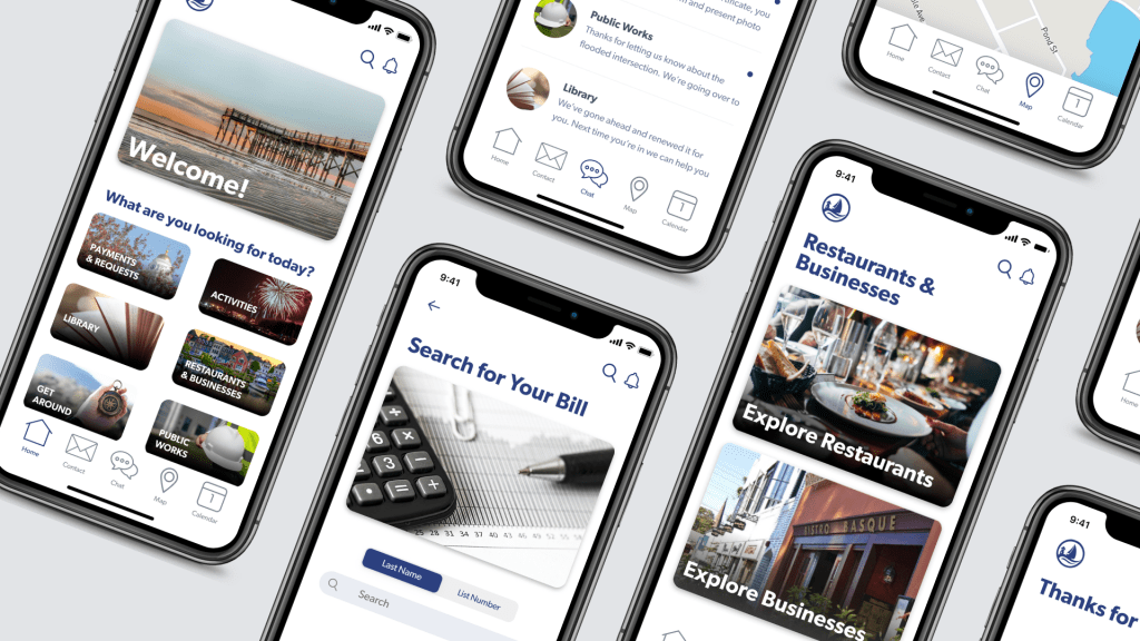
If you are able to do usability testing early in your process with low-fidelity prototypes, as I did for the Milford Resident app project I’m working on, then you will have focused on and vetted some of the bigger picture elements of user experience (UX) design before building a high-fidelity prototype.
This can be important because high-fidelity introduces a whole new host of elements to consider and decisions to be made. If these were put in to play at the same time as you were making higher-level UX design decisions you may have been distracted by small details and lost focus, leading to a product that has great visual design but weak UX design.
That’s what I felt when working on the high-fidelity prototype featured in the video above. It can be really fun to mess around with colors, fonts, and layout for your UI design or get lost in the logic of actually connecting your screens to simulate interactions for users. You start to see something you’ve been thinking about for a while suddenly start to look super real and, of course, that’s exciting.
It’s important, though, to not allow the new elements involved in high-fidelity prototyping to distract you from all the foundational work you’ve done up until this point in terms of user research and UX design.
Since I’d focused for an entire round of prototyping and testing on information architecture and navigation, the UX design for my Milford Resident app felt cemented in my head as at the core of my project goals. Every time I caught myself considering a visual design choice in my high-fidelity prototypes because it looked good or seemed cool, I stopped myself and asked if it served the user. Did it work with or against the UX design? I only wanted visual design that enhanced UX.
UX and UI design meet in any form of prototyping, but in high-fidelity, the rubber really meets the road in terms of seeing how intertwined these 2 design areas actually are for the user. For example, I drew my low-fidelity prototypes with generic dropdown menus for certain input fields thinking nothing of it.
Users didn’t have a problem with them in usability testing and I originally went to include them in my high-fidelity prototypes. I realized, however, that although there was nothing stopping me from using dropdowns, they felt somewhat out of place in an iOS app that was otherwise heavily leveraging native iOS UI elements. I opted instead to use iOS picker menus.
I’d made a conscious UX choice to try and meet the mental models of iOS users with my app in order to maximize the number of iOS-using residents in Milford who would feel comfortable with my app. Throughout my high-fidelity prototyping, I was constantly pulling out my iPhone or looking up images online for reference of iOS UI.
There’s so much that we as users don’t consciously note but expect from the design of certain types of technology. High-fidelity prototyping can reveal to you whether you’ve made a wrong turn or overlooked something small simply because something feels off or doesn’t look cohesive in your design. Lower fidelity options have a much harder time helping with this since they are never presented as real-world equivalents.
My biggest suggestion for high-fidelity prototyping, especially if you’re focused on creating an intuitive navigation experience, is not to wait to prototype until after you’ve designed all your screens. Instead, build a few screens in a particular flow or task then build in all your different connections and interactions on them and preview your prototype going through it in the order you expect users to. This was extremely easy in XD for me as I just had to toggle between 3 top tabs for the different modes.
By doing this I discovered access to the global navigation (home screen) anywhere in the app was not the experience I wanted it to be. Certain screens had no access to return home unless the user backed up multiple screens or completed their current task.
When they did have the upper left logo icon available to tap and take them home, doing so forced them to abandon their current page with no other option to return to it but to go through all the steps they’d done before. This seemed like a frustrating ask for users who may simply want to reference the global navigation at any point in the app.
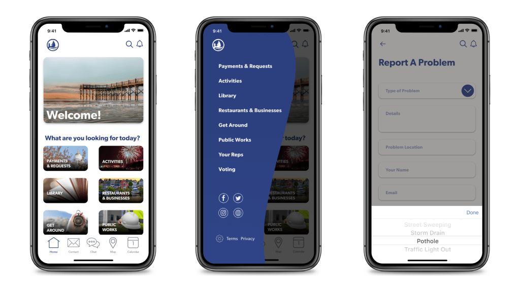
As a result of experiencing this from the user’s perspective early in designing my prototype screens, I made UI adjustments. I added a home button to the always present lower navigation and moved the alerts icon up next to the search icon.
Alerts was the only feature on the lower navigation that was solely passive for the user. Alerts come in when outside parties decide, and users read them. That’s it. But contact, chat, map, and calendar are all features users may actively use so it made the most sense to keep them within thumb’s reach and move alerts. Plus having the alerts icon at the top where users’ eyes travel first may get more users to pay attention to the different messages that come in, which is especially important if they are emergent.
I also changed the upper left logo icon to trigger a slide-out menu including the global navigation. When this is opened users can browse the categories but also simply close it and return to their current screen. Adding this also helped me realize I had neglected considering a place for app settings, privacy and terms information, and links to the city’s website and social media in my low-fidelity prototypes. This slide-out menu provided me a natural home for these.
tHE hIGH-fIDELITY mILESTONE
I’ve just written a lot about how high-fidelity prototyping is just another phase in your iterative design process, but it’s also an important milestone to acknowledge and to be proud of. As I mentioned before, one of the benefits of not starting with high-fidelity prototypes is you don’t have to deal with every decision and detail all at one stage and your overall design will be stronger because of it. The other benefit is the more work you put in before creating high-fidelity prototypes, the more satisfying they will end up being both to build and to present to stakeholders.
By the time you arrive at high-fidelity prototypes, you’ve probably been with a project for a while. It’s become an old friend, but you may have become fatigued at the seemingly theoretical feel of it. You’ve gone through user research, personas, site maps, user flows, ideation, low-fidelity prototypes, you name it.
All of this work is important but only when you reach high-fidelity prototyping do you realize just how far you’ve come, just how close you are to actually creating something to put in users’ hands. Allow yourself to be excited by this. Allow this excitement to energize you for the next phase of the project. And, yes, allow yourself to indulge for a minute in just how cool it is to begin to see your idea realized.
References
Babich, N. (2017, November 29). Prototyping 101: The difference between low-fidelity and high-fidelity prototypes and when to use each. Adobe Blog. Retrieved from https://theblog.adobe.com/prototyping-difference-low-fidelity-high-fidelity-prototypes-use/
Bogawat, A. (2019, April 19). Sketch vs Figma, Adobe XD, And other UI design applications. Smashing Magazine. Retrieved from https://www.smashingmagazine.com/2019/04/sketch-figma-adobe-xd-ui-design-applications/#which-one-do-you-choose
Fairhurst, S. (2019, August 28). Why Adobe XD is better than Sketch. Prototypr.io. Retrieved from https://blog.prototypr.io/why-adobe-xd-is-better-than-sketch-67f943b22a7d
Joshi, D. (2019, November 11). 2019 guide to top 10 prototyping tools for usability testing. UX Planet. Retrieved from https://uxplanet.org/guide-to-top-10-prototyping-tools-745e5b539dbc
Pernice, K. (2016, December 18). UX prototypes: low-fidelity vs. high-fidelity. Nielsen Norman Group. Retrieved from https://www.nngroup.com/articles/ux-prototype-hi-lo-fidelity/
Webster, M. (2018, October 15). Introducing voice prototyping in Adobe XD. Adobe Blog. Retrieved from https://theblog.adobe.com/introducing-voice-prototyping-in-adobe-xd/